VOGONS


DOSBox Icon

Topic actions

Reply 180 of 333, by ChaosFish

User metadata
Rank Member
Rank
Member
Qbix wrote:

Well you guys should hurry. You don't have that much time anymore.

Don't have much time is good, it means a new DOSBox version 😊
In case we don't make real improvements (I'm not so sure about this anti-alias...) I think the current (6.1) icon is good enough.
Qbix - I sent you a PM some time ago with a fixed build of the icon (smaller/better palette).

Here are the PSD files anyhow 😀

Attachments

  • Filename
    DOSBox Icon v6.1 PSD.zip
    File size
    708.41 KiB
    Downloads
    495 downloads
    File license
    Fair use/fair dealing exception

Reply 181 of 333, by Qbix

User metadata
Rank DOSBox Author
Rank
DOSBox Author

yeah I will wait with adding the icon to the latest. If I don't get something by pm by the moment we release It, I will add the 6.1 version.

Water flows down the stream
How to ask questions the smart way!

Reply 182 of 333, by MegaBlast

User metadata
Rank Newbie
Rank
Newbie
ChaosFish wrote:

Hi again,
Sorry for not posting those images you asked for yet. The scaled 256x256 letters with the anti-alias (to fit the 128x128 icon) does look smoother, but naturally less sharp. It's a question, I'm not sure which is better.
I'll post the PSD files tomorrow, with all the layers and everything. (do you have Photoshop?)

I do not have photoshop, I'm just a programmer not graphician. But I have GIMP it can open .psd files. The first thing I noticed in high-res versions was that the letters looked "pixelated". Smoothing them will make them a bit blurred though. I cannot state for 100% it'll better (since that subjective thing), but it's worth to try.

Thanks for helping out MegaBlast! Would be absolutely great if some people can make some "fixes" that I couldn't to make this icon look better 😀

No problem, if your icon get's packaged with the new dosbox release we'll all be using it. 😀

P.S. I think scaling the letters (with anti-alias) to really small sizes like 32x32 or 48x48 is just too much. The 32x32 letters were actually the original, I built the other sizes after it.

Yeah, with size like 32x32 you can work directly on every single pixel. 😀

P.P.S. Did you scale it using your own algorithm? Because Photoshop or Paint Shop Pro can do scaling easily, I can't tell by looking at it if it's better than those programs' scaling.
I always knew about anti-aliased scaling, I just assumed the icon needs to be as sharp as possible 😉

--simon the sorcerer flashbacks--

I implemented my own algoritm (that's why I'm scaling everything that gets in to my hands for the last two weeks 😉), it's very good when you need to increase image size (I'm using 3rd degree polymial for interpolation, the image remains as sharp as possible). When reducing size it's easier, other algorithms/programs also should give good result.

P.P.P.S. Maybe it look less sharp now just because you didn't make it using the original layers (original layer shadows effects, etc.).
As I said I'll post those tomorrow.

In case of the icon I had to scale entire image not only layer (i didn't have background). I think if I had high-res layers to scale down it would look sharper.
But, if letters were created using truetype or opentype fonts then probably the best results would be achieved using font-antyaliasing. There are few types of antyaliasing for fonts, the newest are "cleartype" that were primarily designed for lcd screens. You could play with those. If letters where made using some raster fonts though, then scaling down high-res image is the way to go.

Qbix wrote:

Well you guys should hurry. You don't have that much time anymore.

Good to hear someone still developing this great program. 😀
Reply 184 of 333, by ChaosFish

User metadata
Rank Member
Rank
Member

Looking at the icon on my desktop, I got the feeling it might be a little pale.

This is what I did in 2 minutes in Paint Shop Pro (the second attachment), I just edited the PNG's and added some saturation.

What looks better to you guys? And do you also think it looks too pale the way it is now?

For all I know it can just be my monitor.

To get a better comparison, open each attachment in a separate tab in your browser and switch between the two tabs.

Attachments

Reply 186 of 333, by ChaosFish

User metadata
Rank Member
Rank
Member
Qbix wrote:

could you saturate only the letters ? (and wooden border ?)

That's an excellent idea. I think it actually looks better now.

DOSBox Icon v6.1.1
* Better saturation for the letters and the borders
* Also fixed some things with the colors

The ZIP contains:
* Windows Icon - Size 256x256 is Vista Compressed. (still compatible with previous Windows versions)
* Windows Icon - No compression. Only use this if you're (or someone else is) having trouble with the compressed one.
* Mac OS Icon - Sizes 256x256, 128x128, 48x48, 32x32, and 16x16.
* PNG files - All sizes.
* XPM files - All sizes.

Attachments

  • Filename
    DOSBoxIcon-v6.1.1.zip
    File size
    486.59 KiB
    Downloads
    424 downloads
    File license
    Fair use/fair dealing exception
  • DOSBox Icon v6.1.1.png
    Filename
    DOSBox Icon v6.1.1.png
    File size
    104.35 KiB
    Views
    4813 views
    File license
    Fair use/fair dealing exception

Reply 189 of 333, by Qbix

User metadata
Rank DOSBox Author
Rank
DOSBox Author

the left under corner for example is less sharp. That line that is. that diagonal for example.

Water flows down the stream
How to ask questions the smart way!

Reply 190 of 333, by ChaosFish

User metadata
Rank Member
Rank
Member

Hmm, are you sure?

I tried seeing what you see but I couldn't manage.

I didn't even touch the icons besides making the border and the letters more saturated, and the 'fixed some things with the colors' bit is just me making the 256colors icon look closer to the original 32bit icon.

Not sure if that's important, but here's the icon and the previous one doubled-size. If anyone can explain to me what the fuzziness is, I can fix it.

Attachments

Reply 191 of 333, by eobet

User metadata
Rank Newbie
Rank
Newbie

Well, if there's still competition I guess I can update mine as well.

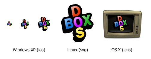
Again, it's inspired by the original MS DOS logotype, but with some classic Super Nintendo gamepad colors added (though DOS is "boring", DosBox is for gaming, right?)... childish, as I said, but hopefully inviting.

I also included an OS X icon here for Machintosh. This, however, is my very first attempt at creating an OS X style icon, so it definetly needs to be refined/redone (therefor, not included in the zip file). It's the old IBM monitor someone in the thread posted earlier, btw. Also included is an SVG icon for use on Linux.

dosbox.png

Attachments

  • Filename
    DOSbox.zip
    File size
    64.85 KiB
    Downloads
    715 downloads
    File comment
    Package with usable icon files for all systems.
    File license
    Fair use/fair dealing exception

Reply 192 of 333, by Targaff

User metadata
Rank Member
Rank
Member

eobet: still like those, personally 😀 What are you using to do the letters? I'm not particularly good with the image editing stuff, so...

Intel CC820 | PIII 667 | 2x128MB SDRAM | 3Dfx Voodoo 5 5500 @ Dell P790 | Creative SB PCI128 | Fujitsu MPC3064AT 6GB + QUANTUM FIREBALLlct10 10 GB | SAMSUNG DVD-ROM SD-608 | IOMEGA ZIP 100 | Realtek RTL8139C | Agere Win Modem

Reply 193 of 333, by eobet

User metadata
Rank Newbie
Rank
Newbie

It's all done in an Illustrator like application called Xara X, including the monitor, so it's all object based and all fully scalable to any resolution (and thus, Linux and SVG compatible). Xara X is availible as a free trial and I do recommend trying it out. It's a lot easier and quicker than Illustrator and I use it for all my professional work.

If you want a completely free alternative, you can try InkScape, though that application isn't very mature yet (but availible for both Linux and OS X).

EDIT: Just tried to edit some of my icons in InkScape... in the version I just downloaded for Windows, the gradient dialogs (popups) were utterly broken, so I'll have to rely on SVG conversion until it is fixed (or until I can try the OS X version, if the problem is fixed there).

EDIT (again): Skip that last bit... it's just me who didn't understand how InkScape worked... it's not as intuitive as Xara (throwing IDs and unfamiliar terms like a "Stop" at you without explanation).

Last edited by eobet on 2006-03-21, 23:27. Edited 5 times in total.

Reply 194 of 333, by `Moe`

User metadata
Rank Oldbie
Rank
Oldbie

I'm not a professional graphics artist, but Inkscape looks rather complete to me, stable and well usable. OTOH, rumours say that Xara might go open source some day.

Reply 195 of 333, by eobet

User metadata
Rank Newbie
Rank
Newbie

It just has: http://www.xaraxtreme.org/

Also, there's a small "3rd party" collaboration between Xara and InkScape as well... but this is OT now (visit the TalkGraphics forum for more info). 😉

EDIT: Back on topic... some variations on the OS X theme. Although, if this icon is chosen, I will redraw it to be more symmetric and better lit (and also to be more SVG compatible as some Xara exclusive bitmap effects are used). I still like the simple, lone text symbol best, though. K.I.S.S. as they say (though it might be too simple for OS X... I'll know in two weeks time when my Macbook arrives). 😀

dosbox-permutations.png

Reply 196 of 333, by nsmcovox

User metadata
Rank Newbie
Rank
Newbie

Inkscape is nearly-almost-but-not-quite full featured (and by this, I mean they haven't got a couple of little things like gaussian blurring and group-based gradiated transparency). Nonetheless it's a pleasure to use, after a little while you can whip up just about anything vectory you want with a minimal of effort, regardless of your aesthetic judgement.
Xara Xtreme looks haaaard.

eobet: That's some lovely work with the old-timey monitor. Is that vector based? My only advice would be maybe to increase the saturation of the beige frame and decrease the ferocity of the scanlines (50% alpha for each alternate line is easier on the eyes).

Reply 198 of 333, by MegaBlast

User metadata
Rank Newbie
Rank
Newbie
ChaosFish wrote:

Looking at the icon on my desktop, I got the feeling it might be a little pale.

It's not the problem it's pale, but the letters and background are both "light" colors. This might causing that lack of sharpness issue.
The 16x16 and 32x32 looks good to me (and these and 48x48 are the ones that really matters). There is something with that 48x48, I have the feeling that "B" is too bold.

As for 96x96, 128x128 and 256x256 they don't look good on LCD if not antyaliased. CRT monitors naturaly antyalias a bit becasue pixels are round there. You should take a look at these icons on some digital display. You probably would be suprised how bad they look. But these are just taking space anyway, dunno where they'll be used.

eobet wrote:

Well, if there's still competition I guess I can update mine as well.

Again, it's inspired by the original MS DOS logotype, but with some classic Super Nintendo gamepad colors added (though DOS is "boring", DosBox is for gaming, right?)... childish, as I said, but hopefully inviting.

That is good, proffesional work, but I think these icons do not suit dosbox. Too much colorful, like WinXP rather than DOS. If I'll be launching some old 4 colors cga game or 16 colors ega then your icon does not render that climat if you know what I mean.
On the other hand, the old monochromatic screen and interlaced text mode... here, you traveled too far back in time. 😀 The last one looks good though.

static- wrote:

Some concept icons a good friend of mine made. I believe they're based from covox_account_sans.ttf's "Z:" icons.

His quote "meh, dos in a box!"

😁

This is a great concept, but why that monitor coming out of the box is lcd? I would expect something older. Also why the box is from cardboard? I would expect something more solid. 😀

Last edited by MegaBlast on 2006-03-22, 10:56. Edited 1 time in total.

Reply 199 of 333, by ChaosFish

User metadata
Rank Member
Rank
Member

MegaBlast - I actually have a pretty new LCD monitor, so I know what you are talking about.
Personally it doesn't look that bad to me, but I agree there is a chance the large sizes might look a little better if they would be anti-aliased. I'm just not sure about that.
I attached the PSD files of the 6.1.1 version, if that would be of any use to you to make some of them look smoother (while sharp enough).

Do you think it would make improvement if I'll make this font in TrueType or OpenType (aka, make it vector)? I can probably do this, but I'm sure it will take me some time because I've never done this before. So if I'm going to do it, it will probably be for the next DOSBox version.

The large sizes are necessary for Windows Vista. In the Windows Vista ux-guideline Microsoft says it's a necessity for any Vista icon (or else the icon can look weird in certain situations).

Attachments