VOGONS


DOSBox Icon

Topic actions

Reply 200 of 333, by `Moe`

User metadata
Rank Oldbie
Rank
Oldbie

Since some operating systems have vector formats for their native icon format, a vector drawing would indeed be better. If you wonder who may be using 128x128 icons - think of high-resolution LCD displays, these even exist on windows, and are common on macs.

Reply 201 of 333, by MegaBlast

User metadata
Rank Newbie
Rank
Newbie
ChaosFish wrote:

MegaBlast - I actually have a pretty new LCD monitor, so I know what you are talking about.
Personally it doesn't look that bad to me, but I agree there is a chance it might look a little better if the large sized icons would be anti-aliased. I'm just not sure about that.
I attached the PSD files of the 6.1.1 version, if that would be of any use to you to make some of them look smoother (while sharp enough).

The problem is you made your icon starting from 32x32 and then made additional "high-res" ones. I assumed you made one large image (or vector graphic image) and then scaled down to small sizes, tuning in pixel mode the smallest ones.
To do something I would need high-res font layers (I mean like 1024x1024 to make nice 256x256).

I downloaded your .psd files for 5.1, I opened them in GIMP and those two top layers with font (I guess font and it shaddow) were screwed (it's GIMP fault I guess - see atachment). when I extracted those layers they looked even more funky.

I put one scaled down 256x256 layer I manualy extracted earlier from .png on 128x128 background, but as you said there is no shadow. The sharpness issue is caused by the low contrast between letter and background color on which letters lie (see attachment).

Do you think it would make improvement if I'll make this font in TrueType or OpenType (aka, make it vector)? I can probably do this, but I'm sure it will take me some time because I've never done this before. So if I'm going to do it, it will probably be for the next DOSBox version.

The large sizes are necessary for Windows Vista. In the Windows Vista ux-guideline Microsoft says it's a necessity for any Vista icon (or else the icon can look weird in certain situations).

There is no rush. High-res icons are not commonly used yet, if it's trouble for you to make you can either give up or try to play with it in free time. For now what most people will use will be 32x32, 16x16 and 48x48.

Attachments

  • gimp256scaled.png
    Filename
    gimp256scaled.png
    File size
    26.41 KiB
    Views
    5476 views
    File comment
    dosbox icon 6.1, psd in GIMP (256x256 divided per 2).
    File license
    Fair use/fair dealing exception
  • 128x128 no shadow.png
    Filename
    128x128 no shadow.png
    File size
    26.96 KiB
    Views
    5476 views
    File comment
    Scaled 256x256 font layer (no shadow) put on original 128x128 background.
    File license
    Fair use/fair dealing exception
Last edited by MegaBlast on 2006-03-22, 11:53. Edited 1 time in total.

Reply 202 of 333, by eobet

User metadata
Rank Newbie
Rank
Newbie
nsmcovox wrote:

Xara Xtreme looks haaaard.

Quite the opposite, imo. Xara is one of the most intuitive and easiest application I have encountered. Working in it is several orders of magnitude faster than Illustrator (for me).

nsmcovox wrote:

eobet: That's some lovely work with the old-timey monitor. Is that vector based? My only advice would be maybe to increase the saturation of the beige frame and decrease the ferocity of the scanlines (50% alpha for each alternate line is easier on the eyes).

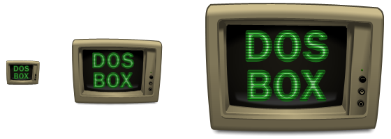
The color is just a transparent overlay, so it definetly will be improved. I don't know about the scanlines. Here's a pic so you can see that it is indeed vector based, and also with 50% scanlines...

dosbox-zoom.png

If you have Firefox, the background above is nicely alpha blended, but if you are using Internet Explorer, all you will get is an ugly grey color.

Reply 203 of 333, by MegaBlast

User metadata
Rank Newbie
Rank
Newbie
eobet wrote:
nsmcovox wrote:

eobet: That's some lovely work with the old-timey monitor. Is that vector based? My only advice would be maybe to increase the saturation of the beige frame and decrease the ferocity of the scanlines (50% alpha for each alternate line is easier on the eyes).

The color is just a transparent overlay, so it definetly will be improved. I don't know about the scanlines. Here's a pic so you can see that it is indeed vector based, and also with 50% scanlines...

No way, scan lines should be 100% black, that's the real interlaced mode. You can make them more tight, so it indeed looked like 1 pixel line, one 1 black line...

If you have Firefox, the background above is nicely alpha blended

Same applies to Netscape and Opera. I think only IE doesn't have support for transparency in pngs.

Reply 204 of 333, by ChaosFish

User metadata
Rank Member
Rank
Member
MegaBlast wrote:

The problem is you made your icon starting from 32x32 and then made additional "high-res" ones. I assumed you made one large image (or vector graphic image) and then scaled down to small sizes, tuning in pixel mode the smallest ones.

I did start from the 256x256 size to make the icon (and the textures/effects), but it's true that I made all the other sized letters after the 32x32 one.

MegaBlast wrote:

To do something I would need high-res font layers (I mean like 1024x1024 to make nice 256x256).

Ok, I'll make a 1024x1024 size letters and will post them here (with no textures or effects as I see GIMP can't handle all Photoshop's features).

I'll be out for the weekend, so I'll only be able post again in Sunday. Hopefully I'll have the 1024x1024 letters by then.

--
About making the entire icon in vector format, I've got a lot of learning to do before I can do this. There's a chance it will happen, but most probably not soon.
In the meantime can't the new Linux distributions handle other formats too, like PNG or XPM?

Reply 205 of 333, by oduverne

User metadata
Rank Newbie
Rank
Newbie

Your icon is the nicest!

eobet wrote:
Quite the opposite, imo. Xara is one of the most intuitive and easiest application I have encountered. Working in it is several […]
Show full quote
nsmcovox wrote:

Xara Xtreme looks haaaard.

Quite the opposite, imo. Xara is one of the most intuitive and easiest application I have encountered. Working in it is several orders of magnitude faster than Illustrator (for me).

nsmcovox wrote:

eobet: That's some lovely work with the old-timey monitor. Is that vector based? My only advice would be maybe to increase the saturation of the beige frame and decrease the ferocity of the scanlines (50% alpha for each alternate line is easier on the eyes).

The color is just a transparent overlay, so it definetly will be improved. I don't know about the scanlines. Here's a pic so you can see that it is indeed vector based, and also with 50% scanlines...

dosbox-zoom.png

If you have Firefox, the background above is nicely alpha blended, but if you are using Internet Explorer, all you will get is an ugly grey color.

Reply 206 of 333, by MegaBlast

User metadata
Rank Newbie
Rank
Newbie
ChaosFish wrote:

Ok, I'll make a 1024x1024 size letters and will post them here (with no textures or effects as I see GIMP can't handle all Photoshop's features).

You can make any effect but export those font related layers as pngs (each layer as transparent png) and give me that pngs. I will try to interpolate them (these layers) to smaller resolutions (256x256, 128x128, and 96x96) and send you back. So, if you find those rescaled layers acceptable you could use them in your icon.

Reply 207 of 333, by ChaosFish

User metadata
Rank Member
Rank
Member

I'll see if I can do that.

The PNG won't be 100% competent to the current layers style because Photoshop has other mergence effects besides partial-transparency, but that probably won't be a big problem.

Reply 208 of 333, by Sanguinius

User metadata
Rank Newbie
Rank
Newbie

I didn't like the new icon for DOSBox 0.65 and made a new one in Illustrator. Please feel free to use/distribute it without consent. The icon is for OSX and Windows. Please drop me a line if the Windows icons do not work as I have no way of testing them.

dosbox_icon.png

Attachments

  • Filename
    DOSBox_icons_osx_win.zip
    File size
    26.36 KiB
    Downloads
    496 downloads
    File comment
    DOSBox icon for Mac OS X and Windows
    File license
    Fair use/fair dealing exception
Last edited by Sanguinius on 2006-04-01, 00:54. Edited 3 times in total.

Reply 209 of 333, by ChaosFish

User metadata
Rank Member
Rank
Member

By the way, sorry I haven't made that 1024x1024 size yet, it's just that it takes more effort than I assumed and as you said it isn't critical right now.
I'll make it sometime 😀

Reply 210 of 333, by eobet

User metadata
Rank Newbie
Rank
Newbie

I was also taken back that you chose a pixel based icon. With an SVG based icon, you could use the same icon across all operating systems, and there would be no problem with a "1024x1024" or a "10,000x10,000" sized icon.

Reply 211 of 333, by jez

User metadata
Rank Member
Rank
Member

This has been quite a fun thread to read, as I've just come across it. 😀

Here are my brief thoughts on it. I was largely responsible for getting the old Mozilla icons done and approved, you can see the results of this work here: http://compendium.game-point.net/

During this design, we too went through a similar thread to this where there was lots of discussion on icon design. I'd make a couple of points about the current design:
- it is indeed recommended widely that you don't use text in an icon. At least, not more than 1 or 2 letters. I know DOSBOX is the name of an executable, but that's still text. IMHO, much better would be either a symbol of dosbox, or a letter or two.
- the curent icon is quite confusing and hard to read, for me. It isn't easy to read it as 'DOS BOX', if anything it's easier to read it as 'BOX DOS'. Sure, if you are used to it, or put some effort into it, you can read it correctly; but the point of an icon is to be very quickly recognisable.

I'm liking eobet's work here, especially the multicoloured icon. The TV screen looks very nice in the large format; unfortunately it's not so good when scaled down. It wouldn't work for 16x16. As for a symbol of DOSBOX, I'd personally go for the Z:\ prompt. Not a word, yet a widely-recognised symbol. If I was as good at graphics as eobet, I might try playing around with creating a multicoloured Z:\ prompt 😀 I think that could look gorgeous at high resolutions and scale well (with just that symbol) to 16x16.

The current icon is clear, but doesn't work at 16x16 (hence it has been laid out differently) and, IMHO, looks a bit amateurish. Almost as if a picture frame template had been used to create the sides of the box... not that I'm suggesting that. *ahem*! Ah well, keep up the good work everyone! 😀

PS. Oh, one last thing; when I'm alt-tabbing through windows and DOSbox is open, I realise there are 2 separate DOSbox windows; one for the video output and one for the status window. Currently they are distinguishable (in Windows), although I'm not sure if this is on purpose - the video output has the 16x16 icon resized and the status window has the proper 32x32 icon. Maybe it would be an idea to design a couple of overlays for the dosbox icon to indicate what window it represents? Perhaps reddish for output, yellow for status? Why? I just picked them randomly.
I told myself I wouldn't get into designing anything, but this is just to quickly represent my idea as it would look at 16x16 (the text would be more antialiased and detailed as you went higher in resolution, but the basic layout and design could be kept the same)...

Remember these are just quickly whipped up by me and could be made to look a lot better by someone with some graphics skill. 😀
Attachments

  • overlay1.png
    Filename
    overlay1.png
    File size
    357 Bytes
    Views
    5217 views
    File license
    Fair use/fair dealing exception
  • overlay2.png
    Filename
    overlay2.png
    File size
    354 Bytes
    Views
    5217 views
    File license
    Fair use/fair dealing exception

== Jez ==

Reply 212 of 333, by DosFreak

User metadata
Rank l33t++
Rank
l33t++

Good points....

- the curent icon is quite confusing and hard to read, for me. It isn't easy to read it as 'DOS BOX', if anything it's easier to read it as 'BOX DOS'. Sure, if you are used to it, or put some effort into it, you can read it correctly; but the point of an icon is to be very quickly recognisable.

Interesting how people read things a certain way. I wonder what would happen if it was changed to BOX being horizontal and DOS being vertical....Probably more complaints most likely. 😉

I read it as DOSBOX because I'm use to reading text from left to right so I read DOS first......

e TV screen looks very nice in the large format; unfortunately it's not so good when scaled down.

No offense to who made it but for me it looks FUGLY. 😀 And again we have the "DosBox" text which you don't like...which would be even worse than the current DosBox 16 icon. So yeah putting a "Z:\" in there would probably be a better idea.

The current icon is clear, but doesn't work at 16x16 (hence it has been laid out differently) and, IMHO, looks a bit amateurish. Almost as if a picture frame template had been used to create the sides of the box... not that I'm suggesting that. *ahem*! Ah well, keep up the good work everyone!

Agreed....mabye the text should be removed leaving the "X" behind? It's probably not that big of an issue so mabye it's not worth it to change it too much. The smaller icon could probably be worked on a little bit to make it look better.

PS. Oh, one last thing; when I'm alt-tabbing through windows and DOSbox is open, I realise there are 2 separate DOSbox windows;

Yeah, I noticed that myself. It was even worse before the inclusion of the icon because I would confuse DosBox with the command prompt!

Also, If you ALT-TAB then the higher quality icon is being used for the DosBox console while the lower quality icon is being used for the main DosBox program.

I think the console icon should have a black background to reflect the default console (although this will be different for different console programs).

Last edited by DosFreak on 2006-04-02, 02:57. Edited 1 time in total.

How To Ask Questions The Smart Way
Make your games work offline

Reply 214 of 333, by MegaBlast

User metadata
Rank Newbie
Rank
Newbie
eobet wrote:

I was also taken back that you chose a pixel based icon. With an SVG based icon, you could use the same icon across all operating systems, and there would be no problem with a "1024x1024" or a "10,000x10,000" sized icon.

Still there would be a need to do a pixel work on low-res icons like 16x16 or 32x32 since vector graphic if scaled down too much might not look good.

jez wrote:

- the curent icon is quite confusing and hard to read, for me. It isn't easy to read it as 'DOS BOX', if anything it's easier to read it as 'BOX DOS'. Sure, if you are used to it, or put some effort into it, you can read it correctly; but the point of an icon is to be very quickly recognisable.
...
DOSBOX, I'd personally go for the Z:\ prompt. Not a word, yet a widely-recognised symbol.

That's again your subjective perception. You note that if that DOS-BOX style writing becomes a "wide recognised symbol" it won't be a problem to those who can't read it correctly at glance.

As to Z:\> prompt I wouldn't agree it's wide recognized dosbox symbol. For me personaly Z:\> associates with Novell network volume since those were often mounted as X:\ Y:\ or Z:\ drives.

DosFreak wrote:

No offense to who made it but for me it looks FUGLY

That was my initial thought when I saw it. I think a classic SVGA CRT monitor would look (and suit dosbox) much better.

Reply 215 of 333, by Dominus

User metadata
Rank DOSBox Moderator
Rank
DOSBox Moderator

Shed, your picture looks very nice and I like that it seems to bring in Vogons elements as well. But as an icon it would only work in the size it is now. In smaller sizes everything would be very hard to make out.
But as I said, I like the picture a lot 😀

Windows 3.1x guide for DOSBox
60 seconds guide to DOSBox
DOSBox SVN snapshot for macOS (10.4-11.x ppc/intel 32/64bit) notarized for gatekeeper

Reply 216 of 333, by MegaBlast

User metadata
Rank Newbie
Rank
Newbie
Shed wrote:
Hello ....i made this one […]
Show full quote

Hello ....i made this one

DOSBox_cubed.jpg

It's a great concept. It's solid, it's a box, it has somethic magical that makes you think of computer games. I think It lacks a bit of DOS flavour I mean this icon has nothing except DOS word that would make me think of DOS as such. I don't know how to achieve that maybe some sort of simplicty is needed.

As an icon proposition there would be a need to see versions of it in 16x16 and 32x32 since, as Dominus pinpointed, after scaling down high res version to such small sizes may not look good.

DosFreak wrote:

Yeah, I noticed that myself. It was even worse before the inclusion of the icon because I would confuse DosBox with the command prompt!

Also, If you ALT-TAB then the higher quality icon is being used for the DosBox console while the lower quality icon is being used for the main DosBox program.

I think the console icon should have a black background to reflect the default console (although this will be different for different console programs).

Now I noticed it as well... I was confusing these two windows even before icon inclusion. I temporary solve it by adding -noconsole switch to dosbox shortcut. I think console window should have default black c:\ icon, it's just an attached log console after all.

Reply 217 of 333, by Shed

User metadata
Rank Newbie
Rank
Newbie

Yes Dominus 🙁

i try reescale to smaller resolution, but the resulting icons "loose" all the definition 🙁

Sorry 🙁

Megablast: thanks !

Reply 218 of 333, by eobet

User metadata
Rank Newbie
Rank
Newbie
MegaBlast wrote:
eobet wrote:

I was also taken back that you chose a pixel based icon. With an SVG based icon, you could use the same icon across all operating systems, and there would be no problem with a "1024x1024" or a "10,000x10,000" sized icon.

Still there would be a need to do a pixel work on low-res icons like 16x16 or 32x32 since vector graphic if scaled down too much might not look good.

If you build your object based icons smart, you don't have to do that. Also, you can't do pixel work on an SVG icon anyway. The picture I posted had pixel work done at 16x16 size, but the one below doesn't. Further, you probably see the large icon first, and can connect the symbol to the small one, and part of my reason for choosing strong colors was to make the different parts stand out at the small size as well.

dosbox-scaled.png

Also, as several have pointed out, some read ChaosFish' icon as BoxDos. I switched my layout. Why? Because although we in the west read from left to right, we don't start in the middle of a page. We start from the top.