Reply 80 of 325, by Qbix

Rank
DOSBox Author
- Rank
- DOSBox Author
yep
Water flows down the stream
How to ask questions the smart way!
yep
Water flows down the stream
How to ask questions the smart way!
Qbix, did you set the registration spambot trap to Q & A challenge? That is the one that I have found the most effective, at least if set to an answer that cannot be Googled.
yep
Water flows down the stream
How to ask questions the smart way!
collector just logout try to register and check that yourself 😉
qbix i think the easiest solution would be this:
Strange that they put the previous page button on the left side of the page, when all the rest of the page controls are on the right.
Previous link is on the left and Next is in the right. These only show if there is a next or previous page in a thread. Other than that, all of the navigation are on the right, page navigation and jump box.
1. Might I add that the Moderators' green color code blends too much with the light purple (lavender?) of the tables and a bit difficult to see? It looks ok with the dark purple outside of the main box (when listed below).
2. And the zetafleet.dom are listed in the disclaimer at the bottom. Two of them.
3. Clicking on an external link does not open in a new tab or window like it did previously, and instead opens up within the same tab/window. Or is this the default behaviour for this new site? I prefer the links to open in a new tab/window so that I can maintain what I was reading in the beginning and/or to refer back. But I wonder how many prefer this way.
4. And, as others have brought up, any chances of including the cool option to alter our titles in our user control panel? 😁
EDIT : Oh, and it's nice to see the Announcements section at each main subsection listing important posts. 😀
wrote:3. Clicking on an external link does not open in a new tab or window like it did previously, and instead opens up within the same tab/window. Or is this the default behaviour for this new site? I prefer the links to open in a new tab/window so that I can maintain what I was reading in the beginning and/or to refer back. But I wonder how many prefer this way.
you got MMB or ctrl-LMB for that 😉
It looks new forum has way smaller amount of characters limit for thread title
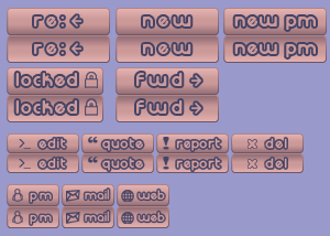
wrote:I like them very much. Could you please also make "onMouseOver" buttons? I think inverting gradient would be enough for that. Or do you think we don't need such a thing? 😀
wrote:They seem larger than the ones that are currently there ?
Please contact collector about it.
Done and done. (Some are a bit larger, yes, but they fit nicely - tested with firefox's stylesheet editor.)
Qbix: I mean the "topic reply notification" emails.
new ones look like
Hello Dominus, […]
Hello Dominus,
You are receiving this notification because you are watching the topic,
"Just an important heads up" at "VOGONS". This topic has received a reply
since your last visit. You can use the following link to view the replies
made, no more notifications will be sent until you visit the topic.If you want to view the newest post made since your last visit, click the
following link:
Re: Just an important heads upIf you want to view the topic, click the following link:
Just an important heads upIf you want to view the forum, click the following link:
MilliwaysIf you no longer wish to watch this topic you can either click the
"Unsubscribe topic" link found at the bottom of the topic above, or by
clicking the following link:--
Thanks,
The VOGONS
The old one is much shorter:
Hello, […]
Hello,
This message is to alert you that the thread entitled "Just an important heads up" at VOGONS has been replied to.
Click the following link to view the new post:
Re: Just an important heads upNo more response notifications will be sent until you review this thread.
This reminder has been sent to you because you requested it.
Use the following link to stop watching this thread:
Just an important heads up--
Thanks,
The VOGONS
I'd prefer the shorter ones. I also dislike the sender of this mail "forumadmin@vogons.org", previosly it was "vogons@zetafleet.com". Something shorter would be nicer, especially without "admin" in it.
Another issue with the "view unread posts" view:
I miss the easy to see field in which forum the unread threads are. Of course they are listed at the end of the information
"Just an important heads up
by Qbix » 2013-5-31 @ 22:50 in Milliways"
but this is not very easy on the eyes, since the subject is so big and the forum name so small in comparison. On the iphone it's even worse since, depending on topic length, the forum name is at the end of the 2nd line or the beginning of the third.
And that orange button is way to small on the iphone 🙁
You need that mobile theme 😀
wrote:2. And the zetafleet.dom are listed in the disclaimer at the bottom. Two of them.
The dom is not a typo. The old board also said dom. It was just Snover being cute. The first one is for the copyright notice and the 2nd is for legal disclaimer to shield the site from idiots that might post warez. Although it might be best to change the disclaimer to vogons.org, now.
Bullet points from the old site do not seem to display correctly on the new site. They now appear as •.
Plan your life wisely, you'll be dead before you know it.
Still taking in all the changes. Wow! Shiny!
"I see a little silhouette-o of a man, Scaramouche, Scaramouche, will you
do the Fandango!" - Queen
Stiletto
wrote:custom ranks, This was a custom mod on the old board. This board, at first glance, doesn't seem to have the ability to let the user select it themselves.
I found this on the PHPbb support forums: https://www.phpbb.com/community/viewtopic.php?f=46&t=2164870
Looks like a relatively straightforward custom mod, but I'm not a PHPbb guru so I could be wrong.
VogonsDrivers.com | Link | News Thread
wrote:@flashback I don't see how it doesn't blend. what did you change ?
Maybe it's my browser (I still use Firefox 3.6) but the logo currently looks like the one on the left and I was suggesting to change it to the one on the right.
The odd thing is, yesterday it looked like someone changed it to the one I linked to and now it's back to the other one.
Anyway, sorry for the confusion.
It is exactly the same one from the original VOGONS.
"View active topics" seems to do nothing... one of the few features I wanted badly...
"I see a little silhouette-o of a man, Scaramouche, Scaramouche, will you
do the Fandango!" - Queen
Stiletto
Little thing: we can't edit our user title anymore. Could you fix that please?