VOGONS

Common searches


New forum suggestions/Feedback

Topic actions

Reply 160 of 516, by gerwin

User metadata
Rank l33t
Rank
l33t
GigAHerZ wrote on 2020-01-05, 07:34:

Saturation has nothing to do with contrast...

? Take some screen colors next to eachother, like green, red, blue. They contrast to eachother. Then decrease the overall saturation to zero, like with photoshop. They become the same grey, without any contrast.

--> ISA Soundcard Overview // Doom MBF 2.04 // SetMul

Reply 161 of 516, by GigAHerZ

User metadata
Rank Oldbie
Rank
Oldbie
gerwin wrote on 2020-01-05, 14:56:
GigAHerZ wrote on 2020-01-05, 07:34:

Saturation has nothing to do with contrast...

? Take some screen colors next to eachother, like green, red, blue. They contrast to eachother. Then decrease the overall saturation to zero, like with photoshop. They become the same grey, without any contrast.

Well, seems you define the word "contrast" your own way, not like everybody else...

And how does it even apply to this forum, where everything is the same kind blue-violet-ish?

"640K ought to be enough for anybody." - And i intend to get every last bit out of it even after loading every damn driver!
Reply 162 of 516, by VileR

User metadata
Rank l33t
Rank
l33t
precaud wrote on 2019-12-29, 13:40:

Purple is at the end of the spectrum, where our eye's sensitivty is the worst, and the color wavelength is the shortest. UV sits right above it. Do you wear sunglasses? It's the part of the spectrum we filter out to reduce eye strain and augment clarity, even under "natural light" conditions. Flooding the background with it is a mistake.

https://iristech.co/what-screen-color-is-best-for-eyes/

There's something about this that should be clarified: short-wavelength violet *can't* be reproduced by computer monitors. In reality it's a very deep blue, which the brain perceives as violet (=with a reddish tinge) because the red photoreceptors in our eyes have a secondary small peak in the far blue end of the response curve.

Computer/phone displays reproduce colors by combining red+green+blue, but the blue component is a 'pure' blue - a little longer in wavelength than real (spectral) violet. So all three RGB primaries sit at longer wavelengths than violet, and you can't create a shorter wavelength by mixing them. You have to mix 'pure' blues and reds - so the purple you're seeing is a mix of two *longer* wavelengths than real short-wave eye-straining violet.

[ WEB ] - [ BLOG ] - [ TUBE ] - [ CODE ]

Reply 163 of 516, by gerwin

User metadata
Rank l33t
Rank
l33t
GigAHerZ wrote on 2020-01-05, 15:06:

Well, seems you define the word "contrast" your own way, not like everybody else...
And how does it even apply to this forum, where everything is the same kind blue-violet-ish?

Truth is: Prolonged use of Photoshop defined it for me. When Photoshop has it wrong I love to hear how.

--> ISA Soundcard Overview // Doom MBF 2.04 // SetMul

Reply 164 of 516, by GigAHerZ

User metadata
Rank Oldbie
Rank
Oldbie
gerwin wrote on 2020-01-05, 15:20:
GigAHerZ wrote on 2020-01-05, 15:06:

Well, seems you define the word "contrast" your own way, not like everybody else...
And how does it even apply to this forum, where everything is the same kind blue-violet-ish?

Truth is: Prolonged use of Photoshop defined it for me. When Photoshop has it wrong I love to hear how.

Well, contrast is pretty much the L component in HSL color system. Difference in Hue (H) is not contrast.

It seems you want to try to define "contrast" by the ability to make difference between two colors. This way, same saturation and light, but difference in hue would be like contrast. But that's wrong understanding of the definition of contrast. Being able to make difference between two colors is not always due to contrast itself. (but because of difference in hue for example)

Last edited by GigAHerZ on 2020-01-05, 15:31. Edited 2 times in total.

"640K ought to be enough for anybody." - And i intend to get every last bit out of it even after loading every damn driver!

Reply 165 of 516, by precaud

User metadata
Rank Member
Rank
Member
VileR wrote on 2020-01-05, 15:09:

There's something about this that should be clarified: short-wavelength violet *can't* be reproduced by computer monitors. In reality it's a very deep blue, which the brain perceives as violet (=with a reddish tinge) because the red photoreceptors in our eyes have a secondary small peak in the far blue end of the response curve.

True, but the point stands that the shorter-wavelength part of the spectrum is the one most responsible for causing fatigue. My UV-filtering sunglasses also take out a big chunk of the blue.

Reply 167 of 516, by j^aws

User metadata
Rank Oldbie
Rank
Oldbie

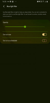
Don't you all have some kind of system settings with your OS/ hardware to overide visual aspects? I've never come across anything that's perfect. For example, on my phone I have the usual brightness and contrast controls, as well as colour temperature. In addition, there is a blue light filter as below:

Screenshot_20200105-162614_Settings.jpg
Filename
Screenshot_20200105-162614_Settings.jpg
File size
244.06 KiB
Views
1542 views
File license
Fair use/fair dealing exception

No forum I've visited has been perfect and I don't expect them to be, but as long as minimum functionality is present then I'm good to go.

Reply 168 of 516, by gerwin

User metadata
Rank l33t
Rank
l33t
GigAHerZ wrote on 2020-01-05, 15:27:

Well, contrast is pretty much the L component in HSL color system. Difference in Hue (H) is not contrast.

Yeah that is the core of our difference in understanding. I just briefly looked at these pages:
https://en.wikipedia.org/wiki/Display_contrast
https://en.wikipedia.org/wiki/Contrast_%28vision%29
And it seems that the term contrast is not properly defined; it has a multitude of possible variants. Maybe leave it at that.

--> ISA Soundcard Overview // Doom MBF 2.04 // SetMul

Reply 169 of 516, by bmwsvsu

User metadata
Rank Member
Rank
Member

Here's a little more elaborate CSS-skinning I did using Chrome's STYLUS plugin - this time aiming for a dark-on-light theme. I still have some elements that require modding but here it is so far:

DIRECT LINK to see image non-scaled

vogons2.gif

Reply 171 of 516, by Stiletto

User metadata
Rank l33t++
Rank
l33t++
kolderman wrote on 2020-01-05, 20:32:

Did something change? The title bar of each post now has a kind of spotted look to it...I think I preferred the previous look.

Yes, several days ago Snover removed the full-post dithering on altering posts and moved it to the "post title bar". I believe Snover is experimenting in trying to find an acceptable location where keep the dithering, so he moved it there. It's possible there may be no good place for it, humorous reference though it was.

"I see a little silhouette-o of a man, Scaramouche, Scaramouche, will you
do the Fandango!" - Queen

Stiletto

Reply 173 of 516, by maxtherabbit

User metadata
Rank l33t
Rank
l33t
kolderman wrote on 2020-01-06, 00:06:

Well, if this forums had polls, and the question was about this so called "dithering", I would vote to get rid of it completely.

same, dithering just sucks I have zero nostalgia for it

Reply 174 of 516, by Stiletto

User metadata
Rank l33t++
Rank
l33t++

BTW, I recently discovered that in post formatting, with the new software choosing font color with message formatting and BBCode (the "COLOR=#FFFFFF" etc. tag) has been removed due to the possibility of users choosing color combinations that are unreadable and not adhering to common Internet visibility/disability guidelines. Bold and Italics and others still exist, but Font Color choice is gone. This was by design.

If any post used it for highlighting in the post database, the color choice is being ignored and converted to the default text color for the chosen theme.

Well, alright, it means Robert's lengthy PC Builds posts (Hello, World! :D - Robert B's PC builds - oogle away freely :) ) will lack that extra bit of panache. No, this is not another thing to throw a fit over.
Another retro forum thing sacrificed to modern UI/UX (and possibly one that makes some sort of sense).

"I see a little silhouette-o of a man, Scaramouche, Scaramouche, will you
do the Fandango!" - Queen

Stiletto

Reply 175 of 516, by GigAHerZ

User metadata
Rank Oldbie
Rank
Oldbie

Because of all the complaining (incl. me) i also wanted to share some thanks about some features:
* New posts have a "NEW" icon near datetime
* Post, where browser scrolls automatically, has also blue emphasis color on that particular post's header

Some time ago i complained about those things and now, as these things are done, the thanks and respect is due. Thank you! 😀

...but what is a post in this thread without complaining?
A thing i noticed is that in the "Active posts" or "Your posts" or any other such list, the link to latest post (the most right column) has a hidden link icon, that only becomes visible when the datetime is hovered. Try to approach this from the right side - you have to go all the way to datetime and them come back right to the icon.
It would be nice to have that icon there all the time or to have the hover react already on that empty spot, where the icon would appear.

"640K ought to be enough for anybody." - And i intend to get every last bit out of it even after loading every damn driver!

Reply 176 of 516, by Dominus

User metadata
Rank DOSBox Moderator
Rank
DOSBox Moderator

the link icon is only there to symbolize that you can click on the date which you can do right away without having the icon appear. It might help to visualize that you can click on the date if the icon were always there.
And/or if the columns switched places, so the replies and views are after the "latest post"? (I'm just asking, I'm not the one who decides or does things 😀)

Windows 3.1x guide for DOSBox
60 seconds guide to DOSBox
DOSBox SVN snapshot for macOS (10.4-11.x ppc/intel 32/64bit) notarized for gatekeeper

Reply 177 of 516, by GigAHerZ

User metadata
Rank Oldbie
Rank
Oldbie

@Dominus, wait, did the datetime become looking like link just recently? For some reason, i didn't catch that you can click on the datetime as well, but right now, it does change color and cursor becomes a hand-icon. Did it recently change to that or i just missed that obvious thing? 😜 Well, as it is right now, i see no problem. Previously (for somewhat unknown reasons now) i thought one can only click on that icon...

"640K ought to be enough for anybody." - And i intend to get every last bit out of it even after loading every damn driver!

Reply 178 of 516, by Dominus

User metadata
Rank DOSBox Moderator
Rank
DOSBox Moderator

It's been like that (clickable, no idea on the hover behavior) at least since the forum update. Could have been working like that in the old forum, too, but I don't know.

Windows 3.1x guide for DOSBox
60 seconds guide to DOSBox
DOSBox SVN snapshot for macOS (10.4-11.x ppc/intel 32/64bit) notarized for gatekeeper

Reply 179 of 516, by GigAHerZ

User metadata
Rank Oldbie
Rank
Oldbie

The arriving thirties are already showing it's signs on me... ugh...

"640K ought to be enough for anybody." - And i intend to get every last bit out of it even after loading every damn driver!