Hi everyone,
Per my message yesterday in the bugs thread I had to spend some time dealing with some 🚨internet bad guy🚨 that thought a targeted denial of service attack was a cool idea, so sorry for not saying much or making any visible progress in the past several days. All the work going on was behind the scenes 👀. On the upside, the site should load faster now (especially pages with many images) and should be less prone to getting spammed (famous last words!).
robertmo wrote on 2019-12-31, 19:59:
Snover wrote on 2019-12-31, 19:21:
GigAHerZ wrote on 2019-12-27, 22:03:
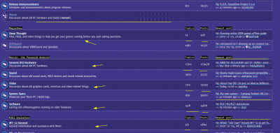
it seems the unread post indicator from each post is missing... 🙁
Can you please explain more what you mean about the unread post indicator?
Orange sheet
There are NEW unread post indicators now!
leileilol wrote on 2020-01-01, 12:59:
While the forum's getting changes, all I can suggest right now is collapsable quotes. Some are chronic big quoters that leave tiny posts (not naming names)
I’ve added this to my list of things!
keenmaster486 wrote on 2020-01-01, 17:47:
One more thing I'm noticing: when you click "quote" on a post in the "review history" tab, it prepends the quote to your message text. Doesn't it make more sense to append the quote?
It should go to wherever the cursor was when you left the editor. So, if the edit cursor was at the end of the message text when you went to quote something, it will be put there. Let me know if it is not working that way, or if it is unhelpful to work this way, and I can change it to force it to the end of the message.
jheronimus wrote on 2020-01-02, 01:35:
However, I was a bit disappointed that 2MB limit for photos remained intact. I think a default photo made on an iPhone is like 7-10MB, so a 2MB limit is really sad. […] I'm pretty sure people ask about this quite often, so I'm just wondering if anyone has ever tried to estimate how expensive it would be to remove a photo limit on Vogons given that the site isn't astronomically huge in traffic/userbase/amount of content. I assume it's just a question of adequate amount of storage after all.
You’d be amazed how much accumulates after 18 years. 😀 We are properly sized for storage and overprovisioned on CPU/RAM/bandwidth to get the storage. I’ve looked at switching to block storage, but that would require a different on-site backup system and then the extra cost of the space for the backup plus the extra effort involved in maintaining it would outweigh the current extra cost (for now, anyway!).
Which is to say, automatic resizing of images is on my list of things to do now.
appiah4 wrote on 2020-01-02, 06:59:
The notifications page for topics I am following is incredibly hard to discern between things I have read and unread.
I’ve put this on my list of things to fix.
appiah4 wrote on 2020-01-02, 06:59:
Also, for whatever reason 90% of my thread subscriptions do not seem to have carried over or for some reason or another I do not get notifications until I go into the subscribed thread and out at least once.
That sounds problematic. I’ve put this on my list to look at. There are certainly more defects in the notification system than I would care to see given that it was a brand new feature… of the major phpBB release before the one we upgraded to.
appiah4 wrote on 2020-01-02, 12:39:
I hate the new typeface. I can understand why Trebuchet may be a reasonably good typeface for certain types of websites but for a forum where ease and speed of reading is most important this highly stylized Verdana derivative is cancer of the eyes.
Every other comment on the typeface in this topic
There seems to be more discussion about this in the welcome topic so I will address all comments related to the typeface there in order to not split the conversation (since there are some screenshots there which I need to address specifically anyway).
kolderman wrote on 2020-01-03, 01:49:
Can we get jump to bottom/top buttons on the bottom/top of the thread pages?
I don’t know what is the purpose of a button to go to the bottom since the only thing at the bottom is a reply box (and there’s a reply button is at the top), but I have added a button at the bottom to go back to the top, as well as a button to return to the parent topic (for in-topic search results) or forum (for topics) since I think someone else also requested this earlier.
beastlike wrote on 2020-01-03, 14:43:
Right now, there's a link on the right hand side that will say like "10 minutes ago" which goes to the last post. Almost functionally identical to the page number, only it'll jump to the bottom of the page, or to the very last post. Before, the link would just go to the top of the last page. Again not a big deal at all, but in stuff like the "I bought this retro hardware" or some of the super popular ones, users may want to catch up on the last 10 or so posts
For what it’s worth, the “first unread post” button at the left is usually the best way to do this. Trying to go to the top of the last page may give you no context at all if the split was exactly on the page boundary, or you may have to do a bunch of scrolling if the page is about to overflow to the bottom.
Also:
sf78 wrote on 2020-01-07, 09:02:
Disruptor wrote on 2019-12-27, 21:55:
I miss the function that shows the last page numbers for each topic in a board.
Yes, it's amazing how this feature was not implemented.
I have noted that many people seem to be having trouble that there aren’t inline page links on the topic list any more. This was done per a request. I will bring it up again.
xjas wrote on 2020-01-04, 00:00:
Can we have "public domain" added as an option for attachments? Otherwise it could look like we're trying to claim copyright on stuff when uploading something that's legitimately in the public domain.
I’m really here only for the ✨technical magic✨ but I will bring it up, since it makes sense to me that there should be a mark for public domain.
Tore wrote on 2020-01-04, 21:04:
The "dithering pattern" has issues on a lot of different LCD devices, be they defective or by user configuration, this is a good reason why such patterns should be avoided on the web.
Apparently, just none of the dozen that were used to look at the site before release 🙁. I am still trying to preserve this, though I fully acknowledge that I may be tilting at windmills at this point. I don’t quite know how anybody manages to run old software on screens that break when asked to display even low intensity dithering, though I suppose that is neither here nor there.
Tore wrote on 2020-01-04, 21:04:
I'd suggest looking into the purple background colour on the old Vogons style.
There is the oldskool theme which retains the original post colours.
Tore wrote on 2020-01-04, 21:04:
I also suggest removing the zebra striping in topic views it adds unnecessary clutter.
One person’s clutter is another person’s ability to track the line to the end, so I am not sure how realistic it is to suggest to remove the striping.
Also, I’m really trying to not just have something that looks like a modern flat design here, which these suggestions—remove stripes, remove patterns, remove lines, remove vibrancy—seem to be destined to cause if they are all followed.
Tore wrote on 2020-01-04, 21:04:
Descriptive text should follow every icon, especially uncommon icons. UI elements with unknown icons and no visible text tend to be ignored, even if there are tooltip descriptions (which obviously don't work on touch devices)
Which icons are the uncommon ones?
Tore wrote on 2020-01-04, 21:04:
The breadcrumbs are kinda cool, but something should be done to make it clear that "C:" is clickable and leads to the index. Maybe just be boring and just rename "C:" to "Index:".
It links to the same place as the logo so labelling it explicitly feels redundant. Actually the only reason why it is even a link is because Qbix was clicking on it reflexively during testing. 😀
Tore wrote on 2020-01-04, 21:04:
Avatar shadows look a bit odd and draws attention to avatars which shouldn't really be getting more attention. The same with button shadows as they are inconsistently applied.
I had a good reason for doing this and I can’t remember what it was at the moment.
GigAHerZ wrote on 2020-01-05, 00:37:
In general, desing-wise, i would just crank the saturation lower and all would be nice. The colors used are a bit too saturated for my taste...
I will give a more thorough response on this whenever I can find the anchor comment I wanted to use to discuss it.
swaaye wrote on 2020-01-05, 00:45:
Interesting thing here. The new site causes Android Firefox to crash/freeze on two tablets I use. The site won't even fully load. Seems related to the display driver or the OS perhaps. HP Pro Slate 8 (Qualcomm Adreno 330) and Teclast T8 (PowerVR GX6250). Works ok on my Pixel (Adreno 530).
Probably something Mozilla needs to fix. I submitted a crash report.
Yikes. So I think that I know what caused this (the attempt to avoid flickering by keeping dots at a fixed position on the screen with background-attachment), though I can’t tell you why it caused it, other than that maybe the browser was trying and failing to do GPU compositing to avoid expensive CPU repaints in those areas. Please let me know if it is OK now.
Paralel wrote on 2020-01-05, 02:47:
I posted this in another thread, not sure which one it should be in, so I'll just put it here as well:
I’ll address this where you mentioned it on the welcome thread.
VileR wrote on 2020-01-05, 12:32:
Yup, the overall choice of bright-on-dark is very welcome; screens are not paper. OTOH there are objective (i.e. scientifically backed) reasons for avoiding very saturated colors as site backgrounds - some examples... not that the colors here are especially bad or anything, but toning it down slightly wouldn't hurt.
Thank you for providing some research. I’ll take a look at the specific studies.
When I did research earlier to try to verify claims about green-sensitivity and high contrast causing eye strain, I ran across one web site which actually bothered to source research. Unfortunately, its sole sourced study was this 1990 “Preliminary Research” paper about how to design interfaces on newfangled colour computers. The web site that referenced it must have read the abstract only and didn’t even bother to look at the data itself. There are so many problems with drawing any conclusions from this study. First, the study size was N=8. Second, the room lighting was uncontrolled (“fluorescent”). Third, they did test a low-contrast scheme which received universally “difficult to read” responses. Finally, the basis of the result that “high contrast” causes eye strain seems to have been one test of full intensity green text on a full intensity blue background (my eyes hurt just thinking about that).
Problems like this are why you should always make sure to at least glance at research instead of taking things at face value whenever possible. I am terrible at critically analysing research, but so many people are even worse at it than I am, and then they write things on the internet.
precaud wrote on 2020-01-05, 12:47:
Just google "eye response to light" and look at the sensitivity curve. Purple is at the end of the spectrum, where our eye's sensitivty is the worst, and the color wavelength is the shortest. UV sits right above it. Do you wear sunglasses? It's the part of the spectrum we filter out to reduce eye strain and augment clarity, even under "natural light" conditions. Flooding the background with it is a mistake.
https://iristech.co/what-screen-color-is-best-for-eyes/
I will vote with my feet and spend less time here until its fixed.
As someone already mentioned, the purple coming from a computer screen is not at any violet wavelength, it is just a combination of red and blue. I am also aware that maximum colour sensitivity in human vision is at green wavelengths, and, it doesn’t logically follow that a background lacking a green component somehow leads to eye strain. If that were the case, logically, black backgrounds would be just as bad because they also don’t have any green in them. On the other hand, white text has the maximum amount of green. So the problem is highly unlikely to be related to green-or-not. However, if can provide research that says otherwise, I would be very glad to read it so I can learn and grow. In the meantime, you should definitely do whatever you feel is right for you.
GigAHerZ wrote on 2020-01-06, 10:48:
A thing i noticed is that in the "Active posts" or "Your posts" or any other such list, the link to latest post (the most right column) has a hidden link icon, that only becomes visible when the datetime is hovered. Try to approach this from the right side - you have to go all the way to datetime and them come back right to the icon.
It would be nice to have that icon there all the time or to have the hover react already on that empty spot, where the icon would appear.
The link icon is an affordance to make it clearer that there is a link there; you can click anywhere on the date to go to the page, not just the icon. I would have preferred consistency with the rest of the links but I was asked to reduce the number of underlines on that page so this was the compromise.
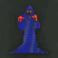
krcroft wrote on 2020-01-06, 17:05:
Attached is what I see in the dithered areas (yellow indicators). Open the PNG in an image viewer at 1:1 zoom if possible. This is on a non-retro Skylake system with HDMI interface to 24' ASUS display running at native resolution.
I can "play" with the moireing patterns by manually resizing my browser; I usually have to resize it carefully to get them to disappear. First time I've seen it in decades since moving on from CRTs.
This is the craziest thing I have seen in a while, and fortunately has nothing to do with the monitor since you took a screenshot and it shows up in the screenshot. It seems highly likely to me, given the triangular shape of the corrupt regions, that these are triangles that are being rendered on the GPU and the texture is corrupted. This is almost certainly a graphics driver bug. Hopefully it is fixed now that I’ve made some changes which would stop GPU layer creation there, but definitely make sure you’ve got up-to-date graphics drivers installed since this probably won’t be the last place you’ll encounter weird texture glitches.
Rekrul wrote on 2020-01-07, 17:35:
I'm sure it's pointless to post this as I'm sure I'll be told that I'm the only person that this applies to, but I figured I might as well make it known...
I have an older system that can only run older versions of browsers. I'm using Pale Moon 26.5 and every page on this site now takes an annoyingly long time to load.
Well, as much as I really would appreciate it if you would please upgrade your OS off of Windows XP so as to not incubate botnets on your computer, it’s also not my intent for anything to be slow like that, and nor can I explain why it would be that way. If you can get some performance profile out of the dev tools then I can inspect that to try to understand what is happening.
Tertz wrote on 2020-01-08, 00:55:
There was a possibility to find your last messages before from the profile. […] also there you may change "author_id" to find latest posts of other users, what is not possible to do from their profiles as before
No functionality was removed here as far as I know. Click the 🔍 search button that is present on all the user profiles to search their posts. The number of posts underneath the username in the sidebar of every post is also the same link as before which goes to search the user’s posts.