Reply 160 of 743, by kolderman
Rank
l33t
Did something happen? It seems darker or something all of a second. I liked the brighter purple, more contrast or something.
Did something happen? It seems darker or something all of a second. I liked the brighter purple, more contrast or something.
Hello,
At the cost of being like an old man who complains about everything (I find that the blue is too blue, the purple is not purple enough and the text is too big, but I'll keep these to myself 😜 ), is there a way to bring back the page numbers next to the post title? So that you can quickly go to the last page of eleventy pages long threads.
Andrea
After I found out that I accidentally had the default zoom in my browser set to 110% for some reason, I have come back to say that now - on 100% scale on 1080p in conjunction with "small font size" and "small line spacing", it is actually small enough, exactly like it was on the old forum version.
Now with the "old skool" theme selected, the differences compared to the old version are minuscule and mainly design-wise.
+1 for old skool being promoted to default theme 😁
Hint: We seem to have two colliding sets of emojis in use..:
😁 😀 🙁 😉 😁 😖 😦
Not great, not terrible.
Seems to take significantly more space to display same content - not great.
Is generally pretty and usable - not terrible.
Suggestions: how about some more compact theme? Also, how about some other colour scheme, such as green on black or some dark grey one?
First impression: One of the rare well-done site modernizations.
The FuD of Vogons becoming like this was unjustified...
I guess many people sighed with relief when they saw you did it not that way 😀
I dislike the new Merriweather Sans font. It is hard to read, especially with its digits, which look like they are vertically unaligned: 123456789
Hardware comparisons and game system requirements: https://technical.city
Okay now I view the new format on my day to day monitor..... nope, I don't like it.
It's too dark... and too purple.
Also, the general "phone friendly" layout, font size, buttons, etc... I'm gonna puke. 🤢
#notmyvogons
The old Vogons needed one thing, change the brown font color to something readable on the purple background.
At least bring back the old purple color scheme as default,,, this dark purple is disgusting.
j^aws wrote on 2019-12-29, 00:29:What browser are you using? Below is desktop mode on Samsung browser with its text size option set at 90%:
I'm on a Motorola with thee default google chrome. how are you adjusting the zoom?
cant find a desktop button. or zoom.
One post takes up a whole page. its painful.
Searching for Epson Actiontower 3000 486 PC.
The animated party hat is a nice touch.
The more I learn, the more I realize how much I don't know.
OPL3 FM vs. Roland MT-32 vs. General MIDI DOS Game Comparison
Let's benchmark our systems with cache disabled
DOS PCI Graphics Card Benchmarks
Cobra42898 wrote on 2019-12-29, 15:23:I'm on a Motorola with thee default google chrome. how are you adjusting the zoom? cant find a desktop button. or zoom. […]
j^aws wrote on 2019-12-29, 00:29:What browser are you using? Below is desktop mode on Samsung browser with its text size option set at 90%:
I'm on a Motorola with thee default google chrome. how are you adjusting the zoom?
cant find a desktop button. or zoom.One post takes up a whole page. its painful.
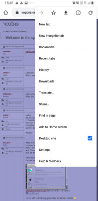
For Chrome, bring up its menu bar (you might have to scroll down to see more options) and you can see the toggle 'desktop mode' option as below:
I can't find any text zoom option in Chrome, but there is one for the Samsung browser. Also, switching between desktop and mobile modes forces a re-login currently. I've requested a fix for this as the previous forum didn't force this.
Agent of the BSoD wrote on 2019-12-29, 06:29:I'm getting used to the new layout. I actually like the way the text is, easier for me to read without having to move closer to […]
I'm getting used to the new layout. I actually like the way the text is, easier for me to read without having to move closer to the monitor. After lurking on here a little and just reading this thread, I'm pretty comfortable with it.
There is one minor thing though, and this likely affects a very small percentage of people, but my monitor really doesn't like the dither on quote fields. On my secondary TN, it's fine, but my primary is IPS and for some reason, it streaks horizontally where the quote blocks are, and also makes the quote blocks themselves green. No clue why, but I've noted this behavior before on some other programs that use dotted pixels like that in a large enough amount. Just thought you should know. I can always just use the oldskool theme to get rid of that quirk anyway.
This is what it looks like:
https://imgur.com/Cwgrqnv
Wow, that panel has some crazy bad crosstalk going on.
Fixing this problem with the dithering is on my TODO list, since obviously there are a lot of panels out there with electronics that can’t handle it properly. I’ll leave it to anyone with more electrical engineering experience to explain why some panels fail to draw high frequency patterns and others are totally fine. (I’ll be interested to know if they confirm my own hypotheses about this. 😀)
Also thank you for the note on the bad upload error, that’s on my list now too.
Yes, it’s my fault.
Subjectivity knows no bounds!
Personally I disagree with 99% of the styling recomendations suggested so far. And personally I think you should all listen to me... coz.
Form should follow function and I feel that has been achieved. Perhaps it is more constructive to concentrate on issues rather than style (unless the style prevents function of course). The purpose of a forum should be on the content, worrying too much about the look will only lead to perpetual bickering.
Back in the late 90's AOL was the only ISP where I was, and I hated triangles, so I went without internet... yay me! o.0
Kudos to Snover and Qbix for the overhaul, I likes it muchly (although tbh, I wasn't offended by the old forum either... you could have a poka dot background and multicoloured text for all I care, as long as images, quotes and other forum functionality work (which so far for me does) and it is legible).
Next stop, to complain at google for using a white background and primary colours in their logo. Yahoo!
It feels broken to me. What was wrong with the old design? I often used it on mobile
Guess I won't be posting for a while, maybe vogons will become more usable in the future.
@spiroyster
Google has always been using the same color scheme...
Arctic wrote on 2019-12-29, 17:23:@spiroyster
Google has always been using the same color scheme...
All the more reason not to use it... sod being able to search for stuff... white burns my eyes, uses more power, and is damaging to the environment. Save the planet! Use a B&W medical display + bing! nuff said.
[EDIT:] Edits work.
For reference, forum settings:
Small text and line spacing, removing avatars and signatures from display options.
Browser settings:
Using 70% text zoom and using mobile mode on Samsung browser using Android 9:
You can see quite a lot of information on screen without feeling cramped as below:
spiroyster wrote on 2019-12-29, 17:18:Subjectivity knows no bounds! […]
Subjectivity knows no bounds!
Personally I disagree with 99% of the styling recomendations suggested so far. And personally I think you should all listen to me... coz.
Form should follow function and I feel that has been achieved. Perhaps it is more constructive to concentrate on issues rather than style (unless the style prevents function of course). The purpose of a forum should be on the content, worrying too much about the look will only lead to perpetual bickering.
Back in the late 90's AOL was the only ISP where I was, and I hated triangles, so I went without internet... yay me! o.0
Kudos to Snover and Qbix for the overhaul, I likes it muchly (although tbh, I wasn't offended by the old forum either... you could have a poka dot background and multicoloured text for all I care, as long as images, quotes and other forum functionality work (which so far for me does) and it is legible).
Next stop, to complain at google for using a white background and primary colours in their logo. Yahoo!
+1. I agree.
And being able to read it on my phone without zooming or rotating the screen (like I used to do with previous design) is MUCH better.
"Design isn't just what it looks like and feels like. Design is how it works."
JOBS, Steve.
READ: Right to Repair sucks and is illegal!
The emoji situation still needs to be addressed (shouldnt be too hard, there seem to be three colliding sets:)
😀 🙁 😁 😜 😉 😖 😦
(I would get rid of the transparent ones, since they are hardly readable on smaller settings, and keep the bigger of the yellow ones. They are inconsistent though in themselves as well, it seems.)
Here is an example why this type of font is not suitable for a forum with technical focus:
"Get the manuals I just uploaded. Instead of JP2 JP1 JP14 J16 for r3.2, the manual states JP2 JP1 JP14 SW1 for r2.2 for clock speed"
The font seems unsuitable for certain letters and number combinations, as well as seems to have an unequally formatted number scheme.
Arctic wrote on 2019-12-29, 17:23:What was wrong with the old design?
See the first post in this thread...