VOGONS


First post, by VileR

User metadata
Rank l33t
Rank
l33t

See Latest update: v2.2 below


Yep, the very-much delayed update is finally out - come have a look at ►► https://int10h.org/oldschool-pc-fonts/ ◄◄

So what's new?
To make up for the 4-year holdup, there's quite a bit:
 

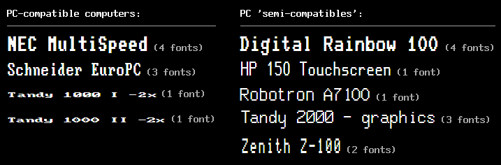
  • 133 new font families, from 52 different hardware, firmware and software sources
     
    An extra special thanks goes to everyone here on VOGONS who has contributed material for this. You know who you are (and if you don't, you're credited in the appropriate README section). 😀
    The scope of the collection has itself expanded a little, and now covers interesting "semi-compatibles" in addition to 100% IBM PC-compatible hardware, but most of the new fonts still come from the True Blue side of things. Here's just a little sample:

    new-fonts.png
     
     
  • New font variants - mixed outline/bitmap (.ttf), aspect-correct (.ttf), webfonts (.woff)
      
    As before, each font name is prefixed to indicate the variant. The basic families from v1.0 are still around:
    'Px' (pixel outline): TrueType fonts that reproduce the forms of the oldschool pixel glyphs
    'Bm' (bitmap): plain Windows .FON versions

    On top of those two, there are three new ones:

    'Mx' (mixed-format): TrueType with embedded bitmaps; should render as sharply as plain bitmap fonts when used at the right sizes.
    They don't completely supplant the 'Px' fonts, since they're not well-supported in all situations (at least on Windows, they don't work well as CP437 "DOS/OEM" fonts). But where they do work, they avoid font-smoothing artifacts just fine.

    anti-aliasing.png
    Embedded bitmaps: text w/ClearType, 10x zoom; 'Px' fonts (left) show fringing, but 'Mx' (right) looks crisp


    'Ac' (aspect-correct): most of these fonts weren't originally used on square-pixel displays, so these TrueType versions are scaled to emulate the faithful pixel aspect, depending on the hardware and video modes that the fonts were used in.

    aspect-correction.png
    Aspect correction: the IBM MDA font in square-pixel rendering ('Px') vs. the original pixel aspect ('Ac')


    'Web': webfonts in .woff format; similar to the 'Px' versions, but the file size is smaller and the metrics make more sense for web usage.
     
     
  • Miscellaneous updates
     
    Other minor bugfixes/changes are listed in the changelog. There's one annoying requirement if you already have older versions of these fonts - regrettably, you'll have to manually uninstall them first, otherwise you'll get a conflicting and inconsistent set (since I had to do a lot of renaming in this new version).
    Maybe in the future there will be a decent installer (recommendations? NSIS maybe?)

    In any case, the website also got an overhaul:
     
    ♦   It's now quite a bit more usable on mobile. Still not 100%, but at least it's not hopelessly broken anymore.
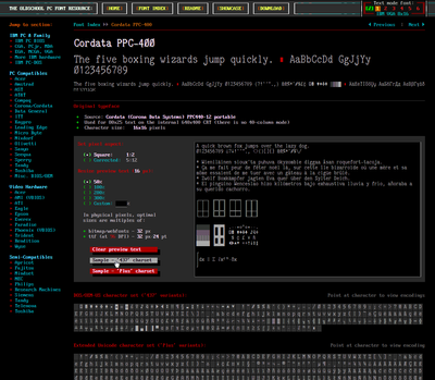
    ♦   Each font now has its own preview/info page, where you can try sizes, aspect ratios and custom text, and get the lowdown on where/how the font was used originally.
    ♦   Under 'Showcase', you get both screenshots and links to other awesome/useful projects showing these fonts in action.
    ♦   More documentation, more historical info on more machines, a new FAQ section, and in general more long-winded verbiage!
    ♦   New ANSI art? As actual character data? With variable fonts? And responsive to boot? Why not. 😉
     
    Screenshot - 2020-07-14, 10_30_35-or8.png
    Filename
    Screenshot - 2020-07-14, 10_30_35-or8.png
    File size
    41.92 KiB
    Views
    2217 views
    File license
    Public domain

Now go and play around with some classic pre-GUI raster typography.

Last edited by VileR on 2020-12-01, 23:56. Edited 3 times in total.

[ WEB ] - [ BLOG ] - [ TUBE ] - [ CODE ]

Reply 1 of 16, by keropi

User metadata
Rank l33t++
Rank
l33t++

😮 site looks amazing! excellent work VileR thanks for sharing!
I also use a vga font on ultraedit 😁

🎵 🎧 PCMIDI MPU , OrpheusII , Action Rewind , Megacard and 🎶GoldLib soundcard website

Reply 2 of 16, by VileR

User metadata
Rank l33t
Rank
l33t
keropi wrote on 2020-07-14, 08:09:

😮 site looks amazing! excellent work VileR thanks for sharing!
I also use a vga font on ultraedit 😁

Thanks, appreciated! Well, now you can have it aspect-corrected too.
I guess "that" VGA font will always be the one people remember. Funnily enough Microsoft used my version of it ("PxPlus IBM VGA8") to showcase Windows Terminal, so I guess I did something right. 😉

BTW, forgot to mention: I've also added these new fonts to the Fontraption archive, so they are also usable in VGA text mode on real hardware.

[ WEB ] - [ BLOG ] - [ TUBE ] - [ CODE ]

Reply 3 of 16, by keropi

User metadata
Rank l33t++
Rank
l33t++

^ooooohhhh it keeps getting better and better!!!
ms did half job, they showed it but did not fix terminal to include it 🤣

🎵 🎧 PCMIDI MPU , OrpheusII , Action Rewind , Megacard and 🎶GoldLib soundcard website

Reply 4 of 16, by DracoNihil

User metadata
Rank Oldbie
Rank
Oldbie

I wonder, is there a way to properly convert the old .FON format to something X11 can use?

Would be interesting to have X versions of the fonts for use in old window managers and xterm.

Either way, I really appreciate your hardwork into this pack. I still use BigBlue Terminal for everything on my current system!

“I am the dragon without a name…”
― Κυνικός Δράκων

Reply 5 of 16, by VileR

User metadata
Rank l33t
Rank
l33t
DracoNihil wrote on 2020-07-15, 04:45:

I wonder, is there a way to properly convert the old .FON format to something X11 can use?

Would be interesting to have X versions of the fonts for use in old window managers and xterm.

Either way, I really appreciate your hardwork into this pack. I still use BigBlue Terminal for everything on my current system!

That's definitely possible - Fontforge can import .fon and export .bdf bitmap fonts (and maybe .pcf as well?), which should be right up X's alley.

Those two formats seem to be pretty universal in the *nix world, so they'd be nice to have in the release itself, and I'd like to do that in future versions. The only problem with that is that my font knowledge is rather Windows-centric: I could create bdf/pcf versions, but I don't know enough about these formats to ensure that I'm doing it properly... i.e. that the metrics are 100% correct, that the fonts can be used for codepage-437 stuff as well as UTF-8, and so on. That'd take some studying and testing to pull off, but I'm sure its doable. Who knows - might turn out to be as simple as running a fontforge conversion script with all-default settings.

EDIT: forgot to mention - someone else has already made bdf versions of the IBM BIOS/CGA/EGA/VGA fonts: https://farsil.github.io/ibmfonts/

On the other hand, it seems that things aren't that simple in Linux anymore, and things like this happen, because developers enjoy breaking stuff: https://www.phoronix.com/scan.php?page=news_i … re-Bitmap-Fonts ... so there's a push for yet another half-baked format as a workaround. But in that situation, I believe that the "Mx" TrueType fonts should work just fine anyway.

[ WEB ] - [ BLOG ] - [ TUBE ] - [ CODE ]

Reply 6 of 16, by imi

User metadata
Rank l33t
Rank
l33t

amazing, I absolutely love how that website looks :3
and it would even work at high ppi screens with zoom (as long as a factor of 2 works nicely)

if only more programs would let you select custom fonts 😒

you just created a lot of work for me now having to try to somehow get my website to look like this 😁

I wish every website would look like this... everything is so clear... easily distinguishible and sharp... oh how far we've fallen.
I am truly amazed.

Reply 8 of 16, by DracoNihil

User metadata
Rank Oldbie
Rank
Oldbie
VileR wrote on 2020-07-15, 10:57:

On the other hand, it seems that things aren't that simple in Linux anymore, and things like this happen, because developers enjoy breaking stuff

Oh please don't remind me, I can't even use GZDoom on my tower system because they won't bother fixing their braindamaged OpenGL renderer to be more feature agnostic and not depend on shader paths that are known to be problematic on AMD hardware.

I'll take a look into fontforge though, thanks!

“I am the dragon without a name…”
― Κυνικός Δράκων

Reply 9 of 16, by VileR

User metadata
Rank l33t
Rank
l33t
imi wrote on 2020-07-15, 13:07:
amazing, I absolutely love how that website looks :3 and it would even work at high ppi screens with zoom (as long as a factor o […]
Show full quote

amazing, I absolutely love how that website looks :3
and it would even work at high ppi screens with zoom (as long as a factor of 2 works nicely)

if only more programs would let you select custom fonts 😒

you just created a lot of work for me now having to try to somehow get my website to look like this 😁

I wish every website would look like this... everything is so clear... easily distinguishible and sharp... oh how far we've fallen.
I am truly amazed.

Gratified to hear that - the site work wasn't all a walk in the park 😉 It's still a bit rough around the edges in places and there are a couple of JS performance issues to fix, but it'll probably be a while before I touch that part of it again.

By far the biggest part of the website work was researching and compiling all the hardware info and notes on how the original fonts were used. To me this kind of stuff needs historical context... otherwise it's not good for much other than "yay retro aesthetic" etc.

[ WEB ] - [ BLOG ] - [ TUBE ] - [ CODE ]

Reply 10 of 16, by xcomcmdr

User metadata
Rank Oldbie
Rank
Oldbie
DracoNihil wrote on 2020-07-15, 17:31:
VileR wrote on 2020-07-15, 10:57:

On the other hand, it seems that things aren't that simple in Linux anymore, and things like this happen, because developers enjoy breaking stuff

Oh please don't remind me, I can't even use GZDoom on my tower system because they won't bother fixing their braindamaged OpenGL renderer to be more feature agnostic and not depend on shader paths that are known to be problematic on AMD hardware.

I'll take a look into fontforge though, thanks!

The software renderer is the way to go anyway.

Bilinear filtering really makes Doom ugly as hell.

Reply 11 of 16, by imi

User metadata
Rank l33t
Rank
l33t

I also tested it on my phone and it looks flawless, that is how mobile versions need to be done, seperate layout that doesn't gimp the desktop version at all 😀

do you happen to have .css templates for the textboxes etc. if you want to share? ^^

Reply 12 of 16, by DracoNihil

User metadata
Rank Oldbie
Rank
Oldbie
xcomcmdr wrote on 2020-07-15, 21:47:

The software renderer is the way to go anyway.

You'd think that, but it turns out the software renderer just goes through their broken OpenGL pathway that shows up as just a black screen with millions of errors in the terminal about shaders not compiling properly.

“I am the dragon without a name…”
― Κυνικός Δράκων

Reply 13 of 16, by VileR

User metadata
Rank l33t
Rank
l33t
imi wrote on 2020-07-15, 23:01:

I also tested it on my phone and it looks flawless, that is how mobile versions need to be done, seperate layout that doesn't gimp the desktop version at all 😀

do you happen to have .css templates for the textboxes etc. if you want to share? ^^

Sorry, didn't use or make any templates, but feel free to inspect with the brwoser devtools and crib the ideas. 😀

BTW, one of the projects linked in the showcase section is Bootstrap/386, which goes pretty deeply into the rabbit hole of translating DOS text UIs to the web: http://kristopolous.github.io/BOOTSTRA.386/demo.html
Can't say I've ever used bootstrap or similar frameworks, but it might be up your alley for inspiration.

[ WEB ] - [ BLOG ] - [ TUBE ] - [ CODE ]

Reply 14 of 16, by VileR

User metadata
Rank l33t
Rank
l33t

Thanks to an insightful tester, I've added some tips about optimizing the look of these fonts in macOS >=10.14. (https://int10h.org/oldschool-pc-fonts/readme/#antialias)

It may be tempting to make a dig at Apple here, but they're not alone these days in pulling this kind of crap. Moral of the story: never assume that UI options really do what they claim to do. *facepalm*

[ WEB ] - [ BLOG ] - [ TUBE ] - [ CODE ]

Reply 15 of 16, by VileR

User metadata
Rank l33t
Rank
l33t

Pushed another update yesterday: ►► Ultimate Oldschool PC Font Pack v2.1 ◄◄

Full changelog is here, but the main news is:

  • 72 new fonts - that's why there's only a minor increment in the version number. 😉
    Again, shoutouts to the fine people who helped source some of the new ones this time: Bill Hart, jhhoward, jesolo, Trixter, T-Squared.

    v2.1_new_stuff.png
     
  • Bitmap fonts are now available for Linux, in the OTB format, which shouldn't suffer from that recent seizure of "let's break stuff that has worked for decades in our routine library updates" (mentioned earlier in this thread).
    Haven't tested them very thoroughly, as this was kind of a last-minute addition. So if anyone wants to have a go and report, I'd be much obliged.

Also: tweaked the website a little bit, with a nice menu up front on the homepage. It should MOSTLY work without JavaScript now, as opposed to giving you a black screen.

[ WEB ] - [ BLOG ] - [ TUBE ] - [ CODE ]

Reply 16 of 16, by VileR

User metadata
Rank l33t
Rank
l33t

A smaller update - v2.2:

v2.2_new_stuff.png
Filename
v2.2_new_stuff.png
File size
3.39 KiB
Views
1663 views
File license
Public domain

Not too much to show off this time, but a few of these things were interesting to look into, nonetheless. It turned out that the Tandy 2000 has a "hidden" 8x8 charset, meant for a low-res "TV" graphics card that possibly was never even shipped. The HP 150 (as recently featured on Adrian's Digital Basement) has some of the weirdest text-generation hardware you've ever heard of, although it does make for some very nice and crisp text. And looking into what the Rainbow 100 does with its text display has resulted in a mamedev bug report, since it's not emulated correctly for the time being.


Also, while I was at it - Flexi IBM VGA, v2.0:

Updated my "de-pixelated" outline adaptation of the default VGA font (I think I posted the first version of this around here before). Instead of relying on xBRZ scaling and auto-tracing, I did this new one manually from scratch, so those weird artifacts from my first attempt are gone: sharp corners are (mostly) sharp, smooth curves are smooth, and serifs look like serifs, rather than obscene suggestions that the character is just really happy to see you:

FlexiIBMVGA_v2_changes.png

FlexiIBMVGA_v2_specimen_e.png

[ WEB ] - [ BLOG ] - [ TUBE ] - [ CODE ]