VOGONS


DOSBox Icon

Topic actions

Reply 160 of 333, by nsmcovox

User metadata
Rank Newbie
Rank
Newbie

Phwoar, now -that- sounds like a challenge 😀

If nothing else comes up, I might have a shot at the IBM look. Only caveat I can think of is the hordes of angry luddites w/pitchforks that'd disapprove of making the Z:\> prompt even smaller on the 32x32 icons

Reply 161 of 333, by DosFreak

User metadata
Rank l33t++
Rank
l33t++

Well I do think it's a big waste of space to have all of that big black screen just taking up space for the icon....even more so for the smaller icon.

How To Ask Questions The Smart Way
Make your games work offline

Reply 162 of 333, by nsmcovox

User metadata
Rank Newbie
Rank
Newbie

Does that mean the alternative I offered for 16/32 sizes is at least a step in the right direction?

nsmcovox wrote:
Probably could be done better pixel-edited by hand, but here's a shrunk version of the icon. […]
Show full quote

Probably could be done better pixel-edited by hand, but here's a shrunk version of the icon.

Small Beige (SVG)
dosbox_s16.png --zoomed in--> dosbox_s32.png

edit: if you think the frame looks a little too prominent on the small one, it's easily fixed. Just noticed then that I ballsed up and had used the old thicker-framed monitor as a source. whoops

Last edited by nsmcovox on 2006-01-25, 06:06. Edited 1 time in total.

Reply 163 of 333, by DosFreak

User metadata
Rank l33t++
Rank
l33t++

Weird, couldn't see those images before on page 8 until I refreshed my cache.

Yeah, that's better than the previous one.

How To Ask Questions The Smart Way
Make your games work offline

Reply 164 of 333, by MegaBlast

User metadata
Rank Newbie
Rank
Newbie
ChaosFish wrote:
Finally, here it is! DOSBox Icon v6.1. http://www.vogons.org/files/dosboxicon-v6-presenting.png […]
Show full quote

Finally, here it is!
DOSBox Icon v6.1.
dosboxicon-v6-presenting.png

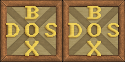
These are almost perfect. I would make letters to blend into background though. Right now the edges are not smooth. There was no alpha channel on the layer with letters only transparent color, and it can be seen in higher resolution icons.

Also, is there something wrong with these letters? I mean that B has it's upper belly bigger than the lower one. Similar distortion is visible in S and X letter.

Reply 166 of 333, by ChaosFish

User metadata
Rank Member
Rank
Member

Thanks for liking it 😀
The letters' edges are not smooth on purpose, they are not anti-aliased in order to make them look as sharp as possible.
Actually there is an alpha channel 😀 I didn't make the alpha channel "bold" but you can see (specially on the big icon) the letters are a little merged with the background.
The B has equal bellies, same with S and X - guarantied. Check in Photoshop if you like 😉

Reply 167 of 333, by MegaBlast

User metadata
Rank Newbie
Rank
Newbie
ChaosFish wrote:

Thanks for liking it 😀
The letters' edges are not smooth on purpose, they are not anti-aliased in order to make them look as sharp as possible.

If you could post or pm me the layer with letters in high res (256x256 at least, but prefferably 512x512 or 1024x1024) I could try to make them look both sharp and smooth. 😉 I recently implemented some interpolation algorithms. Ah, and I would need also a background (in original size 128x128). Assuming it's not a problem, of course.

Actually there is an alpha channel 😀 I didn't make the alpha channel "bold" but you can see (specially on the big icon) the letters are a little merged with the background.
The B has equal bellies, same with S and X - guarantied. Check in Photoshop if you like 😉

Yes I think you're right. It seems you accidentally achieved a visual illusion effect (it's that x-cross that causes it). 😀

Reply 169 of 333, by DosFreak

User metadata
Rank l33t++
Rank
l33t++

You can easily use that one if you want. Windows easily supports changing icons.

The reasons for choosing this icon have already been gone over in this thread.

How To Ask Questions The Smart Way
Make your games work offline

Reply 170 of 333, by MegaBlast

User metadata
Rank Newbie
Rank
Newbie

I just noticed the largest icon is 256x256! I could try to do something with this resolution file... 😀
So the effect I meant was something like on files below. 😈
These are transparent pngs with alpha channel, which you should see unless you're using Internet Explorer.

Attachments

  • plan8.png
    Filename
    plan8.png
    File size
    1.1 KiB
    Views
    3148 views
    File license
    Fair use/fair dealing exception
  • plan5.png
    Filename
    plan5.png
    File size
    2.17 KiB
    Views
    3148 views
    File license
    Fair use/fair dealing exception
  • plan4.png
    Filename
    plan4.png
    File size
    2.71 KiB
    Views
    3148 views
    File license
    Fair use/fair dealing exception
  • plan3.png
    Filename
    plan3.png
    File size
    3.93 KiB
    Views
    3148 views
    File license
    Fair use/fair dealing exception
  • plan2.png
    Filename
    plan2.png
    File size
    6.12 KiB
    Views
    3148 views
    File license
    Fair use/fair dealing exception

Reply 172 of 333, by Reckless

User metadata
Rank Oldbie
Rank
Oldbie
DosFreak wrote:

You can easily use that one if you want. Windows easily supports changing icons.

The reasons for choosing this icon have already been gone over in this thread.

Whatever the reasons, likes or dislikes of the past (haven't read the thread...) it's well accepted that UI elements such as icons should not use text in order to present the application (accessibility/langauge). Whilst this 'rule' may not apply to DOSBox I think something better than a plain box and the text could have been created 😀 I'm not suggesting at all that I could do a better one either!

Reply 173 of 333, by DosFreak

User metadata
Rank l33t++
Rank
l33t++

Well if a "better" one comes along then that one will be used. Until then ChaosFish's icon is very much appreciated and looks great.

and I don't know what icon your looking at but the current icon is anything but "plain".

I'm not saying that the icon is the most super far out imaginative icon ever created. It is after all a square with an X with 6 letters placed around it but it's hardly even close to "plain".

As far as text being in an icon......It's interesting that you mention that it's "accepted that UI elements such as icons should not use text in order to present the application".

Odd, since the the Command Prompt Icon uses a "C:\", AFAIK "C" is a letter although I guess like anything else you can consider it a picture since technically that's what all text is....a picture...of text.

How To Ask Questions The Smart Way
Make your games work offline

Reply 174 of 333, by Alkarion

User metadata
Rank Member
Rank
Member

Well "C:\" has become an abstract symbol which is understood by people of all languages who have dealt with DOS. It's almost synonymous with DOS so that the interpretation is obvious.

Whole program names in the icon are something entirely different. I agree with Reckless: at least if you look at the evolution of icons text has disappeared almost completely. I wonder if any of the OS X icons has text in them. I have not made any comments on the icon so far so I think it would be a little unfair to do it now. Let me just say I would also prefer a non text icon.

Look at this nice gallery. Seems like only the guys at Microsoft used text in icons. And they are not exactly known as the avant-garde of ergonomic GUIs.

Please, be not be offended if I add this quote from the Microsoft XP icon guidebook entry

# Consider the cultural impact of your graphics. Avoid using letters, words, hands, or faces in icons. When you must represent people or users, depict them as generically as possible.

Reply 175 of 333, by DosFreak

User metadata
Rank l33t++
Rank
l33t++

I think 7-Zip uses "7Z" as it's icon.

The Quicktime program's icon is shaped as a "Q".
Opera is shaped as an "O"
Vmware uses a PC monitor and a Tower
Internet Explorer is shaped as an "E"
Other icons for most programs are pretty abstract not giving any clue as to what the program does (which sucks).

So if we were to fit with the above examples then the only logical icon to be chosen are a "DB" icon or an icon representing a computer.

It would be hilarious if "DB" was accepted as suitable for a DosBox icon but not "DosBox".....unless the "C:\" proponents can figure out a way to make their DosBox "C:\" suitably different from the Microsoft "C:\" so as not to confuse the user....also without making the "C:\" look ugly. (Which is any color other than white on black....)

Which of course leads back to "Z:\".....which lends significance to the Z:\ drive which is a common point of confusion for users because they can't read. It's probably not that important tho and I doubt a user would put that much significance into an icon.

Last edited by DosFreak on 2006-03-18, 23:22. Edited 1 time in total.

How To Ask Questions The Smart Way
Make your games work offline

Reply 176 of 333, by MegaBlast

User metadata
Rank Newbie
Rank
Newbie

"DOSBOX" is not just a text. it's a program name and as such it won't be translated so the language argument doesn't hold here. And the way it's written create some kind of logo of this program, which many, including dosbox autor seem to like. An icon as any "art" is a subjective thing, but saying merely "I don't like it" is non constructive criticism, thus of no value. Currently dosbox doesn't have an icon and so far no one presented anything that could match ChaosFish's creation.

And to those who just came by and didn't took the effort of reading the thread (but still took the effort to write, which asks a question why? If one doesn't bother to listen what other have to say, why would he expect others listen to him?) I put the full icon. The screens I posted earlier was merely an "interpolated" layers with text.

Here is original and "interpolated" wersion of 128x128. I think on LCD displays the second looks much better, dunno if it's true on crt monitors.

Attachments

  • Compare128.png
    Filename
    Compare128.png
    File size
    52.34 KiB
    Views
    3076 views
    File license
    Fair use/fair dealing exception
Last edited by MegaBlast on 2006-03-18, 23:29. Edited 1 time in total.

Reply 177 of 333, by DosFreak

User metadata
Rank l33t++
Rank
l33t++

I have to look pretty closely to see the difference @ 1280X1024 on my 21" Sony Trinitron E500 CRT.

The letters do look alot smoother though.

How To Ask Questions The Smart Way
Make your games work offline

Reply 178 of 333, by ChaosFish

User metadata
Rank Member
Rank
Member

Hi again,
Sorry for not posting those images you asked for yet. The scaled 256x256 letters with the anti-alias (to fit the 128x128 icon) does look smoother, but naturally less sharp. It's a question, I'm not sure which is better.
I'll post the PSD files tomorrow, with all the layers and everything. (do you have Photoshop?)

Thanks for helping out MegaBlast! Would be absolutely great if some people can make some "fixes" that I couldn't to make this icon look better 😀

P.S. I think scaling the letters (with anti-alias) to really small sizes like 32x32 or 48x48 is just too much. The 32x32 letters were actually the original, I built the other sizes after it.

P.P.S. Did you scale it using your own algorithm? Because Photoshop or Paint Shop Pro can do scaling easily, I can't tell by looking at it if it's better than those programs' scaling.
I always knew about anti-aliased scaling, I just assumed the icon needs to be as sharp as possible 😉

--simon the sorcerer flashbacks--

P.P.P.S. Maybe it look less sharp now just because you didn't make it using the original layers (original layer shadows effects, etc.).
As I said I'll post those tomorrow.