Reply 100 of 333, by wd
Rank
DOSBox Author
Thanks for your work, looks really nice 😀
Thanks for your work, looks really nice 😀
Thanks wd! 😀
I've just done some research on icons in Windows Vista.
A quote from "MS UX Guidelines":
* Sizes Required sizes are 256 x 256, 32 x 32, and 16 x 16. Optional supported sizes are 128 x 128, 96 x 96, 48 x 48, and 24 x 24. Windows Vista icons scale smoothly between 256 x 256 and 32 x 32. The 256 x 256 icon size is required to support high-resolution monitors.
* Color 32-bit color (24-bit color plus 8-bit alpha channel.)
* Format .ico file format.
This means a few things...
1. My 64x64 icon will most probably never be useable on Windows.
2. I'll need to make a 256x256 icon, which won't be easy since I'll need to remake to box, but I will still gladly put work into it.
3. For perfection, I'll need make a 24x24 and a 96x96 icon.
And another quote from an interesting article:
At the time of writing this article, none of the major icon editors understands Vista icon format. This is no surprise as the format differs considerably.
Which means I can't make the Vista icon properly right now.
So conclusions:
1. For now, please use this version (5.6) for Windows icon. It is the same as 5.5, only without the unneeded 64x64 icon. It saves up some precious KB's.
2. As soon as I can (when there'll be good editing programs and when I'll be certain the format is stable), I'll make a proper Vista icon.
Also in case you're not sure whether to use the 24bit one or the 256colors one, I would recommend the 256colors icon. A lot smaller file, more compatible and practically looks the same.
I'm talking to myself too much... say something! 😜
I'm sorry to break my promise, but perfectionist as I am, I had to make the icon worthy of being called FINAL.
This is the *FINAL* icon for now, the next version will be the Vista version (probably a few months from now).
Final changes:
* All boxes smaller than 128x128 are noticeably better. I'm now finally happy with them.
* No more 64x64 icon. It will never be needed anyway.
DOSBoxIcon-v5.7.zip is the usual ZIP file contains icon in all useable formats.
--
That's it! 😀


heh. I'm staring back and forth between the blank dosbox icon right now and that big honkin' dosboxicon5.7-128.png....weird. 😁
So the 256-color and the 24bit ones are about the same huh? Not really suprising considering the uniformity....hmm. Good thing tho since it means it's the same icon design from low colors to higher.....I hate it when icons for the same programs change when adjusting to different color desktops.
So what's the verdict? Is this the icon we'll use? There doesn't seem to be many other players besides ChaosFish and his design looks pretty nice.
Yes, 256colors' decrease in quality is invisible to the naked eye. That's the one that should be used in my opinion, Windows itself will not display the 24bit icon correctly when in 256colors resolution mode.
And I'm happy you think it's nice!
[edit] Just realized it won't be displayed correctly in 256 colors resolution anyway, cause Windows uses it's own palette 🙄
Well, it is still more compatible. Some Windows versions don't support 24bit icons.
These icons are certainly well done. however I'd like something more 3d-ish 😁
um hello. I'm just a guest, but why don't you have a "Z:\"? 😎
Well the icon isn't bad, but it just doesn't make me want to use DOSBOX. Compared to other icons, it looks rather oldfashioned (granted, DOSBOX is supposed to be retro, but still).
A nice and simple icon is all we need really - the letters dosbox don't have to be in there either so that really expands what we can do.
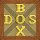
Anyway, this is the icon I've been using:

The D: font is System, and the colours remind me of DOS (blue and black were the two most comon colours back in the DOS days.
I like the fact that the "DosBox" name is on the icon. Helps to identify the icon quickly if you have a ton of icons on your desktop. (Like I would ever launch dosbox that way anyway.....)
You know, that's why you have the name under the icon 😉. Seriously, how many icons have the name of the program inside? It's usually one letter max - the Word and Excel icon for example.
The big problem if you do this is that it gives problems when scaling the icon.When you go down to 16x16, you really have to squeeze in the letters.
Of course I could just make a big flashy "D", but then it wouldn't be special 😀
And I think special is what a logo (mostly) all about really.
I'm quite proud of how it looks like actually, it fits in the desktop nicely and even in the taskbar. And I even think it's representative of DOSBox name and concept. But of course beauty is in the eye of the beholder 😉
What about the crate that has a nice C:\ in front of it? I mean really C:\ says DOS 😀 and perhaps in the back ground above\below the C:\ it says DOS above and BOX below.
The smaller icons would just be the sized crate with C:\ on it..
Thoughts?
We mentioned that earlier in the thread.....
(Note that I am not an authority on what Icon we use for DosBox...these are all my opinions....any icon we choose should be put up to a vote)
The "C:\" is simply the default prompt of DOS. (Since DOS was installed on C:\".
The actual MS-DOS Logo was "MS-DOS" with colored letters. Later Windows 9x\NT took the "C:\" and made it an icon for the "Windows Command Prompt" and the MS-DOS logo for .PIF files.
Therefore it is my opinion that a "C:\" or a "MS-DOS" should not be used for the DosBox icon. We already get waaaaaay too many people confusing NTVDM with DosBox. We don't need to help the matters by making similar icons.
That's why mine says Z:\ instead 😉
Intel CC820 | PIII 667 | 2x128MB SDRAM | 3Dfx Voodoo 5 5500 @ Dell P790 | Creative SB PCI128 | Fujitsu MPC3064AT 6GB + QUANTUM FIREBALLlct10 10 GB | SAMSUNG DVD-ROM SD-608 | IOMEGA ZIP 100 | Realtek RTL8139C | Agere Win Modem
Sorry.. And now that you mention it, I remember reading it! 😳
hi-res:

low-res

Space Invaders... That would be an awesome MAME icon.
You mean something like this?
Would be awesome for launching DOSBox games! 😀

Hmm.. 16x16 looks good too.

Alternate black icons: