VOGONS

Common searches


Welcome to the updated VOGONS

Topic actions

Reply 240 of 743, by robertmo

User metadata
Rank l33t++
Rank
l33t++

there is also this feature that when you click to open something in the separate tab, what you clicked stays highlighted till the next click so that you know what you clicked when you close other tab.

Reply 241 of 743, by Norton Commander

User metadata
Rank Member
Rank
Member
agent_x007 wrote on 2019-12-28, 12:36:
I HATE the secondary color for posts ("lighter purple" ?). It's unwatchable on on S10 since it's only shows dots - like WTF ? ht […]
Show full quote

I HATE the secondary color for posts ("lighter purple" ?).
It's unwatchable on on S10 since it's only shows dots - like WTF ?
QxiA8SW.jpg
^That's how most posts with quotes look like now, on my Galaxy S10 using Opera browser (not logged in/default theme, "mobile" enabled).
Why it's SOOO ugly ?
PLEASE switch it to unified color WITHOUT dots (I do NOT care about every background being the same color even).

Some of us are using high res. displays (and browsers with zoom feature), so I'm not sure WHY someone thought he can get away with this BS shading/grading (?) color scheme.

I'm not seeing any of the dithering you mention on my S9 with Chrome.

Screenshot-2019-12-31-07-49-11.png

I don't see any flickering on my PC either - video refresh issue?

Reply 242 of 743, by Dominus

User metadata
Rank DOSBox Moderator
Rank
DOSBox Moderator

the dithering was changed to a solid color since then. Because of whatever issues the dithering is causing on bad displays.

Windows 3.1x guide for DOSBox
60 seconds guide to DOSBox
DOSBox SVN snapshot for macOS (10.4-11.x ppc/intel 32/64bit) notarized for gatekeeper

Reply 246 of 743, by agent_x007

User metadata
Rank Oldbie
Rank
Oldbie
Norton Commander wrote on 2019-12-31, 13:01:

I'm not seeing any of the dithering you mention on my S9 with Chrome.

I wanted to thank whoever "fixed" the background color 😁
THANK YOU !
KE4VuNJ.jpg
Also, the blinding "dot effect" seen on bar at top is made more pronounced by enabling build-in Night mode inside Opera browser app for my S10. But I can live with that, so no need to fix.

Last edited by agent_x007 on 2019-12-31, 15:52. Edited 1 time in total.

157143230295.png

Reply 247 of 743, by dionb

User metadata
Rank l33t++
Rank
l33t++

Have given myself a while to get used to stuff before commenting.

First the good:
- The mobile usability has increased dramatically. Vogons on a phone with 4.4" screen was a huge pain before, zooming in and out all the time and tapping on the wrong links all the time. Now it's an enjoyable experience.
- Despite more functionality, the speed & responsiveness seems to have increased, not decreased, both on mobile and desktop.

Then the bit I feel could use some improvement:
- Even though I really like the mobile version, I don't like the fact I still don't get the desktop site when I tell my mobile browser to give me one.
- Dithering may have been reduced, but quotes on the mobile version are poorly legible and still flicker when scrolling (Xiaomi Redmi 4X, Android 7.1.2, Chrome browser)
- Why on earth the inconsistency in colour between mobile & desktop? It's like looking at two different sites... edit: seems to have just been addressed. Thanks!
- Desktop usability has taken a dive:

Dominus wrote on 2019-12-28, 16:46:

@Imi, don't forget that this site is about old games on new systems.

That's the whole point. The site looks & works much better now on tiny little mobile screens and on ancient low-res CRTs in my retro-cave, but on modern desktops it's another matter entirely. Even with small fonts and small line spacing, the amount of information on an index page isn't even close to what it used to be, and there's still huge white (er... purple) gaps. It's not just a resolution thing - I have a very similar experience on my relatively low-res 1360x768 laptop vs my QHD 2560x1440 desktop. Zooming out to the point the whitespace becomes more acceptable makes the text far too tiny. The problem seems to be that the line spacing option affects lines within a text block, but not between them, which is where the problem is.

If anything, the low information-density is a very non-retro software feature that is killing a lot of forums' usability. Please don't let it do that to Vogons too!

Making the distance between items respond to the line spacing setting would help a lot.

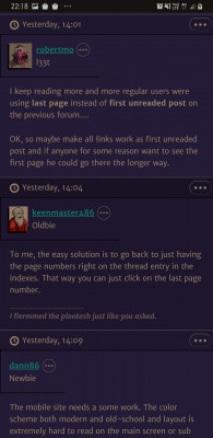
- I'd also very much like to see page numbers on the index pages so I can choose to go to first post, last post or anything in between when I click on a thread.

Bottom line: I've noticed I've been using Vogons a lot less on the desktop this last week, and the increased mobile screen time hasn't been making up for it :'(

Last edited by dionb on 2019-12-31, 17:16. Edited 1 time in total.

Reply 248 of 743, by astonsmith

User metadata
Rank Newbie
Rank
Newbie
Snover wrote on 2019-12-30, 18:49:

Vanilla phpBB has a ton of things that are… let’s say, “not good”. In this case, there was a “jump to page” form which required client-side scripting. I initially made a fallback that excluded the jump form for noscript users, then decided this was silly since there’s no reason client-side scripting should be needed for such a simple feature, so extended the server code so the form worked just fine without client-side scripting. I deleted the fallback from the HTML but forgot to delete the CSS that hid the jump form when JS was disabled. So this should be fixed now, and pagination should make sense again. Thanks for reporting this!

Thanks so much, it makes sense now! Also thanks for making sure the site works 100% without JavaScript, I tend to keep it off by default as it makes my computer lag.

Reply 249 of 743, by Bruninho

User metadata
Rank Oldbie
Rank
Oldbie

Did someone mentioned a very old version of IE being still able to load this forum without javascript? I can't remember in which thread. I've tried both 5.01 and Netscape 4.08, neither can let me log in.

"Design isn't just what it looks like and feels like. Design is how it works."
JOBS, Steve.
READ: Right to Repair sucks and is illegal!

Reply 251 of 743, by j^aws

User metadata
Rank Oldbie
Rank
Oldbie
agent_x007 wrote on 2019-12-31, 15:00:
I wanted to thank whoever "fixed" the background color :D THANK YOU ! https://i.imgur.com/KE4VuNJ.jpg Also, the blinding "dot e […]
Show full quote
Norton Commander wrote on 2019-12-31, 13:01:

I'm not seeing any of the dithering you mention on my S9 with Chrome.

I wanted to thank whoever "fixed" the background color 😁
THANK YOU !
KE4VuNJ.jpg
Also, the blinding "dot effect" seen on bar at top is made more pronounced by enabling build-in Night mode inside Opera browser app for my S10. But I can live with that, so no need to fix.

Norton Commander wrote on 2019-12-31, 13:01:
agent_x007 wrote on 2019-12-28, 12:36:
I HATE the secondary color for posts ("lighter purple" ?). It's unwatchable on on S10 since it's only shows dots - like WTF ? ht […]
Show full quote

I HATE the secondary color for posts ("lighter purple" ?).
It's unwatchable on on S10 since it's only shows dots - like WTF ?
QxiA8SW.jpg
^That's how most posts with quotes look like now, on my Galaxy S10 using Opera browser (not logged in/default theme, "mobile" enabled).
Why it's SOOO ugly ?
PLEASE switch it to unified color WITHOUT dots (I do NOT care about every background being the same color even).

Some of us are using high res. displays (and browsers with zoom feature), so I'm not sure WHY someone thought he can get away with this BS shading/grading (?) color scheme.

***PLEASE SEE BELOW TO FIX OPERA STIPPLE ISSUE***

Okay, just messed with Opera on my Note 9,and the above issue with its Night Mode and the excessive stippling effect comes from the following setting highlighted in red - you need to uncheck 'Dark Web Pages' as it doesn't really work on this site to make it dark, so is a redundant setting:

20191231_221749.jpg
Filename
20191231_221749.jpg
File size
401.68 KiB
Views
2191 views
File license
CC-BY-4.0

When you have unchecked this setting, my Opera page changed from the above stippling effect (basically a negative image to invert colour) to a drastically less pronounced and subtle effect below:

Screenshot_20191231-221808_Opera.jpg
Filename
Screenshot_20191231-221808_Opera.jpg
File size
1.12 MiB
Views
2191 views
File license
CC-BY-4.0

Reply 253 of 743, by Mister Xiado

User metadata
Rank Member
Rank
Member

Holy Lord, this is a visual cacophony. I initially thought that the site had been taken over by domain jackers and turned into a top-ten-list clickbait farm.

b_ldnt2.gif - Where it's always 1995.
Icons, wallpapers, and typical Oldternet nonsense.

Reply 254 of 743, by badmojo

User metadata
Rank l33t
Rank
l33t
Mister Xiado wrote on 2020-01-01, 01:25:

Holy Lord, this is a visual cacophony. I initially thought that the site had been taken over by domain jackers and turned into a top-ten-list clickbait farm.

Post your suggestions here:

Re: New forum suggestions/Feedback

Life? Don't talk to me about life.

Reply 255 of 743, by cde

User metadata
Rank Member
Rank
Member
Snover wrote on 2019-12-31, 07:03:
cde wrote on 2019-12-28, 18:05:

I can't login to the site with Firefox 38.8. It says "The submitted form was invalid. Try submitting again" even though the login/password is correct (had no such problem with the old site). I even allowed vogons.org to execute in NoScript but to no avail.

I don’t know why that would be happening. phpBB has a pretty… bad… anti-CSRF implementation, so I’ve seen that message quite a bit when the short lifetime tokens expire, but the second submission always works since the token is refreshed. Also, the login form is just a plain HTML form, so I’m afraid I don’t have any useful advice other than to upgrade your browser since FF38 sounds like an rootkit just waiting to happen (NoScript will not protect you from vulnerabilities in the image decoder) 😀

Thanks. Unfortunately trying to login twice does not work. Old versions of Firefox are required on this PC which is an Athlon XP that does not support SSE2.

Also what did you think of my suggestion:

I'd personally like to have two more color themes available:

- black on white (useful in sunlight)
- light gray on black (useful in the dark)

Reply 256 of 743, by Dominus

User metadata
Rank DOSBox Moderator
Rank
DOSBox Moderator

Snover already replied in this thread or another why more themes are not feasibly.

Windows 3.1x guide for DOSBox
60 seconds guide to DOSBox
DOSBox SVN snapshot for macOS (10.4-11.x ppc/intel 32/64bit) notarized for gatekeeper

Reply 258 of 743, by Norton Commander

User metadata
Rank Member
Rank
Member
cde wrote:
Thanks. Unfortunately trying to login twice does not work. Old versions of Firefox are required on this PC which is an Athlon XP […]
Show full quote

Thanks. Unfortunately trying to login twice does not work. Old versions of Firefox are required on this PC which is an Athlon XP that does not support SSE2.

Also what did you think of my suggestion:

I'd personally like to have two more color themes available:

- black on white (useful in sunlight)
- light gray on black (useful in the dark)

What OS are you running? Maybe we can recommend an alternate non-sse2 browser.

Reply 259 of 743, by cde

User metadata
Rank Member
Rank
Member
Dominus wrote on 2020-01-01, 13:01:

Snover already replied in this thread or another why more themes are not feasibly.

That's too bad. High-contrast themes such as black on white or light grey on black can be really useful for people with visual disabilities.

Norton Commander wrote on 2020-01-01, 14:01:

What OS are you running? Maybe we can recommend an alternate non-sse2 browser.

I use Windows XP SP3 and Debian 8.