VOGONS

Common searches


Welcome to the updated VOGONS

Topic actions

Reply 280 of 743, by Dominus

User metadata
Rank DOSBox Moderator
Rank
DOSBox Moderator
dann86 wrote on 2020-01-02, 14:32:
gdjacobs wrote on 2020-01-02, 05:50:
Intel486dx33 wrote on 2020-01-02, 04:00:

If it's NOT broken then don't fix it.
The old version was better.

It was broken. The version of phpbb used was no longer supported with current versions of PHP. Nobody wants to see the forum defaced or cracked wide open, so it's best to use a platform that receives patches for vulnerabilities as they're discovered.

Broken and unsupported are two different things. Wile I understand the need for the upgrade I don't think its going to stop anyone from spamming the site by shit posting.
Hopefully the staff here knows to install patches ASAP as hackers are known look at security patches for vulnerabilities then look for sites that have yet to apply the patches.

oh, well then it wasn't broken but no longer safe to use. Different but same result... no need to argue over it, it needed to be supported by current php so it isn't a huge open door for everyone.

Windows 3.1x guide for DOSBox
60 seconds guide to DOSBox
DOSBox SVN snapshot for macOS (10.4-11.x ppc/intel 32/64bit) notarized for gatekeeper

Reply 281 of 743, by gdjacobs

User metadata
Rank l33t++
Rank
l33t++

It's broken, just not too badly yet. It will only get worse.
https://www.cvedetails.com/vulnerability-list … PHP-5.6.40.html

All hail the Great Capacitor Brand Finder

Reply 283 of 743, by Dominus

User metadata
Rank DOSBox Moderator
Rank
DOSBox Moderator

try the oldskool theme and other than that no, no extra themes but the existing ones might get updates. see Re: New forum suggestions/Feedback

Windows 3.1x guide for DOSBox
60 seconds guide to DOSBox
DOSBox SVN snapshot for macOS (10.4-11.x ppc/intel 32/64bit) notarized for gatekeeper

Reply 284 of 743, by Orka Borka

User metadata
Rank Newbie
Rank
Newbie
Snover wrote on 2020-01-02, 06:06:
Orka Borka wrote on 2020-01-01, 16:52:

The color scheme is... sorry, but it feels quite hard on my eyes - it could be formally correct in terms of WCAG color contrast but the white text on indigo/bluish tone feels like flickering. Had to switch to the old color scheme. Tested it on both a regular middle-of-the-road laptop screen and a BENQ BL2420PT color graded monitor with sRGB color profile.

It is indeed WCAG Level AAA compliant.

Could you explain what you mean by “feels like flickering”?

Basically it feels way too saturated for a background color, and "bleeds" into the pure white text.

Even if the contrast level is correct per WCAG, the hue/saturation relationship is maybe a little jarring? Violet is perceived by the human eye as a cold/dark hue, especially on additive color surfaces, and to compensate maybe you boosted the saturation level?

I'm probably talking to a Graphic Designer, so there's no need to "mansplain" on my side, but this post explains way better than I could my point.

(Also for anyone with a bit of interest on this topic, give a look at the books from alistapart.com, maybe their writing style feels a bit too "embellished" for those who are looking for a strictly technical manual but the analyses are quite on point. The book on color accessibility is this one. )

Last edited by Orka Borka on 2020-01-02, 23:40. Edited 1 time in total.

Reply 285 of 743, by imi

User metadata
Rank l33t
Rank
l33t
dionb wrote on 2019-12-31, 15:15:

Bottom line: I've noticed I've been using Vogons a lot less on the desktop this last week, and the increased mobile screen time hasn't been making up for it :'(

yeah, I've noticed that too unfortunately... I honestly haven't been here for very long so I'm not going to pretend like I have a deep connection with vogons or anything, but I was really happy when I found this forum, because of course the topics are of great interest to me and it is a nice community, but also because it was a very nice desktop experience to use the forum apart from some quirks (that are still present in the new design though, i.e. buttons above posts instead of below) going against the current trends of "bad" web design imho.

I'm just finding it odd especially regarding the topic of this forum that they went the route of optimizing the site pretty much exclusively for mobile devices, killing off the desktop experience.
the site is absolutely unusable for me with the default font still, and disabling custom fonts makes buttons unrecognizable obviously, but at least I can read the text which is the core functionality of the site.
the smileys look super awkward on desktop with current scaling...
I'm sure the site "looks fine" (I'm not a fan of the general layout/design, lack of seperation anyways) on a high DPI 4k+ display with font smoothing, but that is simply not how I use my PC or plan to use it anytime soon, I am a fan of low-DPI screens and I love crisp pixel-accurate fonts.
I know I'm repeating myself and I'm not here to argue with anyone, I'm just sad to see the site going this way.

reading on mobile is fine now tbh now that the dithering is gone, but that's totally not what vogons was about for me, of course I sometimes checked the forums on my phone to see if there was anything new, but when I wanted to post something or read up about a particular topic I would do that on the PC, and now when I open the site the experience is just not enjoyable anymore... I try managing to go into the threads I enjoyed and then I leave before participating anymore because it's too much of a hassle... I have barely been on vogons the last few weeks.

Reply 286 of 743, by Dominus

User metadata
Rank DOSBox Moderator
Rank
DOSBox Moderator

Well it has just been a week and the holidays take their toll 😉

Windows 3.1x guide for DOSBox
60 seconds guide to DOSBox
DOSBox SVN snapshot for macOS (10.4-11.x ppc/intel 32/64bit) notarized for gatekeeper

Reply 287 of 743, by robertmo

User metadata
Rank l33t++
Rank
l33t++

I figured out why some people find fonts not clear on desktop

You have to disable "smooth edges of screen fonts"

Attachments

  • clear_fonts.png
    Filename
    clear_fonts.png
    File size
    18.68 KiB
    Views
    1954 views
    File license
    Fair use/fair dealing exception

Reply 289 of 743, by Firtasik

User metadata
Rank Oldbie
Rank
Oldbie

Anti-aliasing settings can be forced through ~/.config/fontconfig/fonts.conf 🐧

Example:

<?xml version="1.0"?>
<!DOCTYPE fontconfig SYSTEM "fonts.dtd">
<fontconfig>
<match target="font" >
<edit mode="assign" name="autohint" >
<bool>false</bool>
</edit>
</match>
<match target="font" >
<edit mode="assign" name="rgba" >
<const>none</const>
</edit>
</match>
<match target="font" >
<edit mode="assign" name="hinting" >
<bool>true</bool>
</edit>
</match>
<match target="font" >
<edit mode="assign" name="hintstyle" >
<const>hintslight</const>
</edit>
</match>
<match target="font" >
<edit mode="assign" name="antialias" >
<bool>false</bool>
</edit>
</match>
</fontconfig>

11 1 111 11 1 1 1 1 1 11 1 1 111 1 111 1 1 1 1 111

Reply 291 of 743, by imi

User metadata
Rank l33t
Rank
l33t
robertmo wrote on 2020-01-03, 06:15:

I figured out why some people find fonts not clear on desktop

You have to disable "smooth edges of screen fonts"

the issue is the contrary, the font used is not meant to be displayed without smoothing, it looks really wonky and off when not smoothed (different thicknesses of lines, positions off by a pixel here and there) and that makes it really hard to read, smoothing on the other hand makes it blurry, and while easier to read it is still straining on the eyes a lot.

that's why there is a need for pixel-perfect fonts imho, and there are plenty out there.
a pixel accurate font is so much more crisp than smoothed fonts that are just blurry on normal resolutions, you need something beyond 4k resolution on a smaller screen to make these appear crisp again.

I have a 27" 1920x1200 and 32" 2560x1440 screen on my main desktop, and probably not even 4k would be enough to make this font enjoyable to look at at that size, you'd need even higher DPI for it to look crisp.

and tbh I don't think most people are using high-DPI screens yet, apart from phones and some laptops, hence why it looks fine on phones.

Reply 292 of 743, by robertmo

User metadata
Rank l33t++
Rank
l33t++
devius wrote on 2020-01-03, 12:39:

If a website requires users to change their PC settings to work properly then something is wrong with the website.

It's not just this website. It's for other websites, programs and windows itself. It even helped previous vogons forum, and scummvm site/forum that still uses font prevoius vogons used.

Reply 293 of 743, by Bruninho

User metadata
Rank Oldbie
Rank
Oldbie

I just can't understand some people complaining. Instead of being happy with a new, safer forum, mobile-friendly design (I for one am happy with that, most of my access to VOGONS is through mobile). Some are picky and want to complain about the font. Some other, about the colors. Only a few complaints were valid IMHO (the dithering issue) and were fixed later. Fair game. Before the new design, my only complaint was the lack of a mobile-friendly version, and now we have it. So far, amazing.

Colors and fonts will never please everyone, I know. It's a subjective thing, for example I like a classic black on white design, and I prefer fonts like San Francisco (Apple's new default), Helvetica Neue (Apple's previous default), Lucida Sans, and Menlo for terminal on Linux/macOS, and Fixedsys for mIRC, but I am not complaining because I know how hard it is for the VOGONS staff to design a website, yet alone a very good forum like this one.

For example, at work I have to deal with Moodle, its a very complex CMS for schools/training/courses to customize, but not harder or terrible than e-commerce CMS like Magento. Forums like phpBB, however, are in the same category of difficulty level.

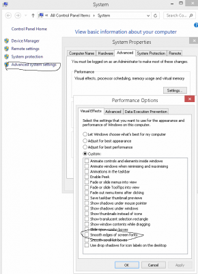
To be fair, The Old School theme is almost the same thing used in previous forum version, and I believe the staff chose it as an option because they knew some people would not like the new default design, there is always someone that will dislike.

The Old School theme is light purple, even the link colors are the same as before. I don't remember people complaining about these colors back then. It's the one I am using because I got used to it, because I prefer the black text instead of white text. I'd be used to the default theme too, if I were using it for at least one week. The two options we have are IMO two big opposites and should be enough to please most people in the wide range between them.

The Trebuchet font is within the web safe fonts list, it's readable, it was very popular for web designs in late 90's/early 00's, it's not my first choice font, but like some people prefer to be picky and complain about "the numbers not being vertically aligned", I am not complaining. Oh well, neither Jesus Christ was able to please everyone. And to be honest, I can't even remember which was the font used in previous version.

Can we be happy with the new, fresh and better forum we have now, and go back to our retro-activities?

I come here not only because of the old software/games I like, but also because I like to see what other people are doing with old hardware, pushing the boundaries of it. It's amazing to see very old stuff being brought back to life by you people, bringing back also good memories. It's also amazing to see the work of ppl like thegreatcodeholio and DosBox-X, or keenmaster486 with the WebOne and more to make retro computers be still relevant for modern web browsing.

"Design isn't just what it looks like and feels like. Design is how it works."
JOBS, Steve.
READ: Right to Repair sucks and is illegal!

Reply 294 of 743, by James-F

User metadata
Rank Oldbie
Rank
Oldbie
imi wrote on 2020-01-03, 12:45:

that's why there is a need for pixel-perfect fonts imho, and there are plenty out there.

Our eyes are least sensitive to blue/purple short wavelength, and with the eye straining crooked font.... the perfect recipe for a headache, Thanks!
Nobody is using high DPI screens to browse Vogons... this is a retro PC and DosBOX forum... no teenager comes here with their smartphone and retina displays.
Pardon me, but "future proofing" the Vogons forums for high DPI displays is just a bad excuse.
Please change the background color and fix the fonts to something more readable,, I'm getting old for unnecessary headaches.

And a happy new year to all!


my important / useful posts are here

Reply 295 of 743, by konc

User metadata
Rank l33t
Rank
l33t
bfcastello wrote on 2020-01-03, 13:41:

I just can't understand some people complaining. .....

Let me try to help: Some don't like the colors and the font and the font size and the trippy zig zag lines and the white mash everything has become and many more. So this is a good reason to complain, not liking something specific is insignificant of course, a lot of things ruin the experience.

Reply 296 of 743, by imi

User metadata
Rank l33t
Rank
l33t

I don't "complain", I simply state that the site is not usable for me in it's current form, yes I dislike the new design, but I could live with that even if I don't enjoy using it as much as the old one that had clear seperation and more compact content and UI elements, but the font is a major hurdle to even use the site at all, and like I said, disabling custom fonts makes it readable, but renders all the UI unusable in turn, so yeah.

Reply 297 of 743, by Dominus

User metadata
Rank DOSBox Moderator
Rank
DOSBox Moderator
James-F wrote on 2020-01-03, 13:47:
Our eyes are least sensitive to blue/purple short wavelength, and with the eye straining crooked font.... the perfect recipe for […]
Show full quote
imi wrote on 2020-01-03, 12:45:

that's why there is a need for pixel-perfect fonts imho, and there are plenty out there.

Our eyes are least sensitive to blue/purple short wavelength, and with the eye straining crooked font.... the perfect recipe for a headache, Thanks!
Nobody is using high DPI screens to browse Vogons... this is a retro PC and DosBOX forum... no teenager comes here with their smartphone and retina displays.
Pardon me, but "future proofing" the Vogons forums for high DPI displays is just a bad excuse.
Please change the background color and fix the fonts to something more readable,, I'm getting old for unnecessary headaches.

And a happy new year to all!

1. I am using a high DPi screen to browse Vogons on my desktop
2. I am coming here with my smartphone that has a retina display (but, yes, I'm not a teenager)
3. I think people still miss what VOGONS stand for: Very Old Games On New Systems. NEW SYSTEMS. The retro PC people came later and sometimes seem to think that they own the forum.
4. Try the oldskool theme, it's very similar to the old theme.

Windows 3.1x guide for DOSBox
60 seconds guide to DOSBox
DOSBox SVN snapshot for macOS (10.4-11.x ppc/intel 32/64bit) notarized for gatekeeper

Reply 298 of 743, by imi

User metadata
Rank l33t
Rank
l33t
Dominus wrote on 2020-01-03, 14:51:
1. I am using a high DPi screen to browse Vogons on my desktop 2. I am coming here with my smartphone that has a retina display […]
Show full quote

1. I am using a high DPi screen to browse Vogons on my desktop
2. I am coming here with my smartphone that has a retina display (but, yes, I'm not a teenager)
3. I think people still miss what VOGONS stand for: Very Old Games On New Systems. NEW SYSTEMS. The retro PC people came later and sometimes seem to think that they own the forum.
4. Try the oldskool theme, it's very similar to the old theme.

the vast majority of new systems do not have high DPI screens apart from phones (and I think most of the topics on here don't refer to playing on phones :p)
and in the current PC market landscape this wont change for the next several years either.

people are still mostly buying full HD monitors, even 1440p is already more than the norm (and mostly present on larger monitors anyways) and anything higher is niche still.

I am happy if the site works for you on a high DPI screen, but that is simply not what most people have.

Reply 299 of 743, by Dominus

User metadata
Rank DOSBox Moderator
Rank
DOSBox Moderator

Well, "vast majority" still leaves a minority and that is > nobody. As well as "most topics not refering to playing on phones" still leaves some, but the point was that this is NOT a retro PC and DOSBox forum, it is much more than that.

Windows 3.1x guide for DOSBox
60 seconds guide to DOSBox
DOSBox SVN snapshot for macOS (10.4-11.x ppc/intel 32/64bit) notarized for gatekeeper