Reply 360 of 743, by Dominus

Rank
DOSBox Moderator
- Rank
- DOSBox Moderator
As Snover already wrote, please all calm down...
As Snover already wrote, please all calm down...
I'm simply pointing out the irony in doing a modern redesign, telling everyone who complains to "get with the times", and then whacking in the Win95 mouse cursor. If that offends you, feel free to ignore me.
A) no one was offended by your irony
B) your timeline is off, the cursor hijacking came with the redesign
C) Snover is not telling everyone who complains to get with the times
D) the level of offense this cursor hijacking causes is astounding
E) not a fan of it either
A) Seems like you are from your replies
B) Your interpretation of my timeline is off
C) I wasn't referring to Snover
D) It's pointless and counterproductive
E) k
A) my post was not a reply to yours or anything about the cursor
C) is the one who did the design, also the cursor thing. And he hasn't told people to get with the times. And people who said that didn't change the cursor... hmmm
Calm down.
stamasd wrote on 2019-12-27, 22:36:My eyes! My eyes!
Mixed experience
on HP ZR30w - both themes poor tuned, new to agressive, old - "poor contrast" (S-IPS, GTX 980)
on Samsung 245T - both looks ok (S-PVA, Quadro 2000)
Certainly wasn't expecting this. It was a surprise when I logged in just now. I certainly can appreciate see the creativity in how this design's come about with the merging of different retro gui's while getting along with the very simplistic/minimalistic aesthetic.
No comment on colour, I think Flux has destroyed how my monitor shows reds. Doesn't help it's pretty old.
Um.. I hadn't noticed the pointer change to be honest, but then the linux boxes I use have mostly simplistic WMs and simple pointers so it wasn't all that noticeable in the first place..
By the way, after switching to Old Skool theme I am OK with the site layout aside from the font, which is still pretty terrible, especially for numbers and capitalized text.
Retronautics: A digital gallery of my retro computers, hardware and projects.
I'm still not fully sure what to think of the new theme. I wasn't partial to the old one, but I can't say yet whether this is better or not, I will have to give it more time. At least the site's better to browse on phones, but I'm not sure whether a large portion of the user base necessarily was waiting for that or not.
That said, I will agree that changing the cursor is not very user friendly. I have my cursor set as I like on my computer, why does this site think it knows better what I want? That it isn't an opt-in feature is a bit ridiculous. It gives me similar feelings as forums having snow effects on during the holidays, it's cute for about five seconds, then it becomes an annoying, stupid gimmick that hampers user experience.
EDIT: And the fact everything is CC. I now know this already was a thing before the redesign, and at least it's clear now, but I'd very much like to be able to disable that for at least photos. Otherwise I'm going to pull all my photos from the site, and do external image linking as to preserve my copyrights on those photos.

I haven't noticed any cursor changing on my end, which is odd because i've had other sites change the cursor (like exotica) so I don't think it's my browser and I do use Win95 stock theme cursors anyway
I noticed the cursor change immediately. I don't mind it, although it's not a perfect reproduction of the classic Windows cursor.
World's foremost 486 enjoyer.
Daniël Oosterhuis wrote on 2020-01-06, 12:07:EDIT: And the fact everything is CC. I now know this already was a thing before the redesign, and at least it's clear now, but I'd very much like to be able to disable that for at least photos. Otherwise I'm going to pull all my photos from the site, and do external image linking as to preserve my copyrights on those photos.
You can pick "fair use" when you upload an attachment. AFAIK attacments were always considered CC along with the post content on the old board. I think this had to be made more explicit due to some "I'm leaving the board forever and I'm deleting every post I ever made! I own my posts and you can't stop me!!!1"-meltdowns in the last couple years.
Putting the license out front and center is a bit uglier, but IMHO it's good to make sure everyone's on the same page. Maybe the "CC-BY-4.0" caption (& now-visible image filename for pictures) could be done in the 'small' or 'tiny' font size?
twitch.tv/oldskooljay - playing the obscure, forgotten & weird - most Tuesdays & Thursdays @ 6:30 PM PDT. Bonus streams elsewhen!
Bug report.
User Computer: iPad
1) When uploading multiple photos if one is larger than 2mb the post locks up and no way to get out or remove large photo.
Switching to Old School color scheme made it so I dont get headaches when viewing the forums anymore at least.
Not a fan of the theme in general, and I find myself browsing the site a lot less recently because of the theme, but I am but a low post count introvert so not much will be lost.
I'm a fan! Well done, admin team!!
Now I'm thinking the vogonsdrivers CSS could do with a bit of a spruce-up! 🤣
VogonsDrivers.com | Link | News Thread
gordon-creAtive.com wrote on 2019-12-27, 22:03:I'm sorry, I don't want to complain, but I find the new design makes it rather difficult to read the pages. I feel like there's too much 'noise', too great contrast and not enough alignment of the different elements of the page.
I find the front page is difficult to read and see the difference between read and unread. They're both white.
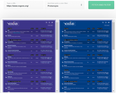
The threads aren't that bad. However the entire color theme feels like the designer might be colorblind.
https://www.toptal.com/designers/colorfilter? … ess_type=protan
I’m really liking the look of the new site! Great work!
Starting Windows 95. . .
Starting to get slightly annoyed at the sense of entitlement some posters are exhibiting here...
Let me put something into perspective... we are all visitors here to a privately owned, free to us (no adverts plastered over the place) forum which someone pays for and maintains. tbh Whatever the owners choose to have as a theme is entirely up to them. It's gracious enough that they are open to feedback, let alone provided user customisable themes (and then there's the other thread which outlines how ppl can play with their own css styling). So it's not like you are forced to keep with this style.
Do people even remember what the old forum looked like... it's not like that wasn't on the blue-end of the spectrum... yet I don't remember many complaining about it then? Fine time to grow an opinion. It's really quite alright to say "I don't like the colour/theme", nothing wrong with having an opionion, but some of the other reasons ... seriously?
A few little teething problems , nothing major which doesn't appear to get fixed in due course. This site has worked on all of my computers, all of my screens IPS, LED and LCD... (not tried retro ones, but then again not expecting it to work on them anyway) and all of my tablets/phones ... chrome, firefox, edge... edge renders slightly differently but still perfectly usable. I find it quite amusing what some people must be doing to their poor computers/browsers to get the experience they are getting. Either they are doing something wrong or I am... I mean snover is obviously well versed in web development, and most developers worth their salt test stuff... I don't think snover made a theme that doesn't work for most people, yet just so happens to work for a few?
To be quite frank, if people don't like the new site perhaps they should vote with their feet, as I feel if they are that offended by it, I doubt many of them could add constructive value to many of the conversations that happen here anyway. Given this forum has been somewhat modernised, it's quite questionable how some function with the rest of the internet in 2020 (or even the last 5+ years) since this site seems to cause them so much pain and suffering?
There have been some quite fanciful reasons posters in this thread have attempted to perpetrate in relation to the choice of colours, which may hoodwink some, but are quite obviously their sensationalist way of saying... "I don't like the colour" ... but this is a new one:
Kisai wrote on 2020-01-07, 07:28:However the entire color theme feels like the designer might be colorblind.
https://www.toptal.com/designers/colorfilter? … ess_type=protan
Care to elaborate? Since the colour appears to render perfectly fine for me (I pass all the Ishihara tests), whether I like the colour or not is a subjective matter, not an eye condition... are you saying I'm colour blind also?