VOGONS

Common searches


Reply 300 of 758, by reenigne

User metadata
Rank Oldbie
Rank
Oldbie
ripsaw8080 wrote:

I'm having trouble correlating what you've written to the point I made. For one thing, I'm looking at mode 4, which means color burst is enabled; and for another, I haven't mentioned anything about text.

Ah, sorry - I thought you were talking about robertmo's Quest for the Time-Bird screenshots.
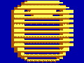
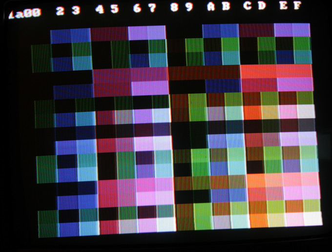
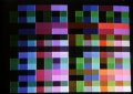
ripsaw8080 wrote:

In the bottom two rows of the attached palette image, many of the colors have little difference and so don't have a luma gradient at the upper end. It's quite different from the smooth gradients in mode 6, and gives blockier fringes when there is no difference in those gradient steps.

The palette might be a bit misleading though - because of the way it's constructed for that algorithm, not all the colours in it will actually ever get used by the draw routine. There are fewer ways to make colours with very high or low luma than there are to make colours in the middle, but the palette includes all luma/chroma combinations.

Reply 301 of 758, by reenigne

User metadata
Rank Oldbie
Rank
Oldbie
NewRisingSun wrote:

I'm talking about the CRTC's HSYNC signal, not the composite hsync pulse.

The CRTC's HSYNC signal doesn't directly control any monitors though, so that's not the only thing you need to (and hence horizontal position) though - just that shift register which is used to generate the actual HSYNC pulse (for both composite and RGB outputs).

NewRisingSun wrote:

Of course the 832 pixels do not really comprise a 4:3 image, so one could compromise by only taking the center 752 pixels from this

The active (i.e. video-memory driven) signal starts 10 (11?) lchars after the (output -SYNC) horizontal sync pulse starts in both modes though - surely that's all that matters for the horizontal position?

Reply 302 of 758, by reenigne

User metadata
Rank Oldbie
Rank
Oldbie
NewRisingSun wrote:

In any case, 80 column text should be shifted to the right, while all other modes should be shifted to the left. I could imagine that switching from black to color 6 in 80 column text mdoe would then shift the whole picture to the left as well on some monitors.

On my TV, there is no noticable difference in image position between 80-column text mode and 40-column text mode. Changing the overscan colour to 6 in 80-column mode doesn't enable the color burst, but it does make the active image really dark (too dark to read). It doesn't have any effect on the position either.

Reply 303 of 758, by NewRisingSun

User metadata
Rank Oldbie
Rank
Oldbie
reenigne wrote:

The active (i.e. video-memory driven)

Which signal now? "Active" in composite video parlance refers to the start of what would be called the overscan area. There's no equivalent in video parlance for the "display" (i.e. non-overscan, coming from video memory) area, although "title-safe" and "action-safe" area come close.

reenigne wrote:

The active (i.e. video-memory driven) signal starts 10 (11?) lchars after the (output -SYNC) horizontal sync pulse starts in both modes though - surely that's all that matters for the horizontal position?

That depends on whether you consider the start or the end of the sync pulse as the reference point.
If you use the start of the sync pulse as the reference point, then the shorter sync signal makes no difference (except for choking off the color burst), and horizontal centering will be exactly as in the 40 column mode.
If you use the end of the sync pulse as the reference point, it will make a difference though: since HSYNC is only 10 hchars = 5 lchars long and the shift register is gated by HSYNC, the sync pulse will only be three instead of four lchars long, thereby end earlier and thereby shifting the picture horizontally.

According to SMPTE 170M, the start of the sync pulse is considered the "horizontal reference point", although I don't know if that is just a theoretical convention or if actual monitor hardware works that way. I still expect some variation between monitors.

By the way, does shifting by 15 degrees match your observed picture? How about variations in the color burst amplitude? 😀

Reply 304 of 758, by VileR

User metadata
Rank l33t
Rank
l33t
ripsaw8080 wrote:
http://www.vogons.org/files/mode4_palette1_intense.png […]
Show full quote

mode4_palette1_intense.png

Oh - yes, I see what you mean about the levels now.

You're right: the way I calculated the gradient levels seems to introduce problem values towards the brighter end of each "column" - the Y component flies off the handle and gets clamped to 1.0.

This can probably be mitigated by changing line 246 in vga_other.cpp -

double YY = (Ylevel==0) ? Y+(1-Y)*j/4.0 : Y*j/Ylevel;

to this -

double YY = (Ylevel==0) ? Y+(1-Y)*j/4.0 : ((j<=Ylevel) ? Y*j/Ylevel : Y+(1-Y)*(j-Ylevel)/(4-Ylevel));

which sort of makes more sense, and should give a smoother gradient, even though it's a more complex calculation. I don't have much time for testing at the moment, but I think this should work - will try later on; maybe you can check it out for now.
Thanks for those builds and for testing!

[ WEB ] - [ BLOG ] - [ TUBE ] - [ CODE ]

Reply 308 of 758, by robertmo

User metadata
Rank l33t++
Rank
l33t++

thanks, edited the story and colors (with the ones used in dosbox from this thread) and also added game examples (pictures) showing all possible colors (they don't display so you have to click them).

This shows how sierra's palette evolved.

PC junior palette was the original for this game and was also adapted to display on cga composite cards. For later version of the game they tried to enhance cga composite although final effects were not very good.

As cga had only one shade of gray thay used black for the darker first, later they used two grays of the same shade for that.

Cga also has no red and light red so they had to use purplish red and light ping for that.

As a result of that they had no light pink so they had to use dark pink instead and gray instead of dark pink. Later they brought back dark red and introduced orange (that was not used before at all) instead of light pink which was not a good idea.

As cga had only one blue-green that could be used for both blue and green items, so they tried to handle is somehow with final result being rather worst of all, as i guess they more tried to reproduce better matching shades of green and blue than matching the actual game items that appeared blue instead of green or green instead of blue as a result.

I think all newer games that appeared already with ega support had new cga palette that was actually worse than the old one used in booters. And these games also used orange as a lighter shade of brown that was using light pink in cga. They shouldn't have made any improvements to cga in my opinion. So the only way to play newer games properly was to use ega.

It looks that with first cga attempt they tried to much colors so that the game looks best. The second attempt looks like they tried to much colors as much as possible without checking how game will look. And as a result it looks as if it was buggy.

Attachments

Last edited by robertmo on 2012-04-27, 07:07. Edited 2 times in total.

Reply 309 of 758, by robertmo

User metadata
Rank l33t++
Rank
l33t++

What do you think about enhancing alt-F10 with some more options:
old, new, egalike, etc.? I guess this would allow removing all complications related with manual adjustments and would make people way more happier.

Reply 310 of 758, by nikiniki

User metadata
Rank Member
Rank
Member
robertmo wrote:

What do you think about enhancing alt-F10 with some more options:
old, new, egalike, etc.? I guess this would allow removing all complications related with manual adjustments and would make people way more happier.

I agree. I'd like to play CGA composite games with EGA palette.

Reply 311 of 758, by robertmo

User metadata
Rank l33t++
Rank
l33t++

I have added palette transformation used by sierra's Troll's Tale. I guess this one was used before kq1booter. It is using higher intensity. They left pink shades correct but broke light red shade. Different handling of dark gray as dark blue. And a nice mess in the blue/blue-green colors - no wonder this transformation wasn't used long 😉

Don't know what (or even if) Winnie the Pooh in the Hundred Acre Wood is using any transformation as I don't know whether ega/pcjr version of that game existed.

All other sierra games use the last (right most) palette:
Donald Duck's Playground
Mickey's Space Adventure
King's Quest II: Romancing the Throne
King's Quest III: To Heir is Human
The Black Cauldron
Space Quest: Chapter I - The Sarien Encounter
Leisure Suit Larry in the Land of the Lounge Lizards
Mixed-Up Mother Goose
Space Quest II: Chapter II - Vohaul's Revenge
Police Quest: In Pursuit of the Death Angel
Gold Rush!
King's Quest IV: The Perils of Rosella
Manhunter: New York
Manhunter 2: San Francisco

So it looks if anyone wanted to make egalike (or even some pretty) palette he would have to make it for each game separately 😉

Attachments

  • sierra_colors_chart.PNG
    Filename
    sierra_colors_chart.PNG
    File size
    16.69 KiB
    Views
    1221 views
    File license
    Fair use/fair dealing exception

Reply 312 of 758, by VileR

User metadata
Rank l33t
Rank
l33t

@ ripsaw8080
I went ahead and tested my idea above -

VileRancour wrote:
changing line 246 in vga_other.cpp - double YY = (Ylevel==0) ? Y+(1-Y)*j/4.0 : Y*j/Ylevel; […]
Show full quote

changing line 246 in vga_other.cpp -
double YY = (Ylevel==0) ? Y+(1-Y)*j/4.0 : Y*j/Ylevel;

to this -
double YY = (Ylevel==0) ? Y+(1-Y)*j/4.0 : ((j<=Ylevel) ? Y*j/Ylevel : Y+(1-Y)*(j-Ylevel)/(4-Ylevel));

...and yeah, it doesn't work nearly as well as I thought. It does produce smoother luma gradients, and gets rid of the clamping, but the end result is actually worse - see the first image attached: the weird edge transitions are more prominent than before in Decathlon (and elsewhere).
Conclusion: as far as 320x200 modes are concerned, 80 palette entries just aren't enough. Comparing to cga2ntsc output, it seems that the pixel-pairs which show this effect should have a different hue, with luma levels that aren't currently represented.

reenigne wrote:

The palette might be a bit misleading though - because of the way it's constructed for that algorithm, not all the colours in it will actually ever get used by the draw routine. There are fewer ways to make colours with very high or low luma than there are to make colours in the middle, but the palette includes all luma/chroma combinations.

Haven't quote considered this before, but yes, see the last two images attached; there are 28 colors (give or take) that seem to be unused. At least if I trust the output from "16x16x16.exe" in this test suite: http://www.seasip.info/VintagePC/composite.zip - these patterns seem to run the line drawing routine through every possible value.

Am I correct to assume that this would still be the case if we doubled the number of entries to 160 (giving ~56 unused colors)?

robertmo wrote:

So it looks if anyone wanted to make egalike (or even some pretty) palette he would have to make it for each game separately 😉

Yes. Mapping composite to RGB colors is pretty arbitrary after all, so a universal DOSBox patch can't (and shouldn't try to) cover such a thing. At least you have the PCjr/Tandy/EGA version of these games.

Attachments

  • palette_usage.png
    Filename
    palette_usage.png
    File size
    5.33 KiB
    Views
    1174 views
    File comment
    "*" = the 16 continuous composite colors
    "U" = unused colors (never returned by the linedrawing routine)
    File license
    Fair use/fair dealing exception
  • 16x16x16_000.png
    Filename
    16x16x16_000.png
    File size
    11.21 KiB
    Views
    1174 views
    File license
    Fair use/fair dealing exception
  • decathlon_worse.png
    Filename
    decathlon_worse.png
    File size
    7.33 KiB
    Views
    1174 views
    File license
    Fair use/fair dealing exception

[ WEB ] - [ BLOG ] - [ TUBE ] - [ CODE ]

Reply 313 of 758, by reenigne

User metadata
Rank Oldbie
Rank
Oldbie
NewRisingSun wrote:

If you use the start of the sync pulse as the reference point, then the shorter sync signal makes no difference (except for choking off the color burst), and horizontal centering will be exactly as in the 40 column mode.
If you use the end of the sync pulse as the reference point, it will make a difference though: since HSYNC is only 10 hchars = 5 lchars long and the shift register is gated by HSYNC, the sync pulse will only be three instead of four lchars long, thereby end earlier and thereby shifting the picture horizontally.

Yep. I just did some experiments and was able to determine that the generated horizontal sync pulse in +HRES mode is only 3 lchars long. The following image was made by using 40-column text mode with +HRES set and border colour 14, which gives a corrupted image and makes the sync pulse visible in the middle of the picture:
hres_sync_pulse_width.png

The fact that my TV doesn't shift the picture between 40 and 80 column text modes means it must be taking the start of the sync pulse as the reference point.

NewRisingSun wrote:

By the way, does shifting by 15 degrees match your observed picture?

For composite colour 8, setting DOSBox to -10 or -15 degrees seems to be closest, but that makes composite colour 4 a bit too blue. The same thing is visible on a photograph: the following image shows all the combinations of chroma and artifact colour in the mode with 0x1a in port 0x3d8. The "standard" composite artifact colours are along the bottom and the chroma colours are down the right:
chart1a00.png

Perhaps the reason a single hue shift won't work for all colours is due to a difference in colour temperature and/or primaries between my TV and the DOSBox/monitor combination next to it. I'll have a play about and see if I can calibrate it better.

I did the calculation with the flip-flop asymmetry and that gives 16 degrees of hue shift between color burst and colour 8 with palette 15.

NewRisingSun wrote:

How about variations in the color burst amplitude? 😀

Still working on that one...

VileRancour wrote:

Am I correct to assume that this would still be the case if we doubled the number of entries to 160 (giving ~56 unused colors)?

No, the 160 colour algorithm works a different way - using exactly the set of colours that can actually be generated. In fact I think the 16x16x16 image would use all 160 colours equally often.

Here are my screenshots for Bruce Lee and Decathlon (it took a bit of time because my serial cable decided to stop working reliably so I had to rewrite some of the routines I use to transfer programs to my XT):

brucelee.png
decathlon.png

I verified that this same Bruce Lee executable has narrow text in DOSBox.

Reply 314 of 758, by reenigne

User metadata
Rank Oldbie
Rank
Oldbie

I've uploaded an archive containing (full-resolution) photos of all the CGA composite colours in all graphics mode/palette register combinations to http://www.reenigne.org/misc/cga_composite_calibration.zip. The program that generates these is http://www.reenigne.org/misc/chart.com (it won't work on DOSBox though because it changes the palette register every 12 scanlines).

Reply 315 of 758, by Qbix

User metadata
Rank DOSBox Author
Rank
DOSBox Author

brucelee uses int10 0x9 to write the status bar to the screen.
characterheight=8 on the 0x40:85

Last edited by Qbix on 2012-04-27, 17:03. Edited 1 time in total.

Water flows down the stream
How to ask questions the smart way!

Reply 316 of 758, by NewRisingSun

User metadata
Rank Oldbie
Rank
Oldbie
reenigne wrote:

Here are my screenshots for Bruce Lee and Decathlon

For what it's worth, attached is Decathlon with my current algorithm (and a delay of 14 MHz and 3.58 MHz of -15 degrees) and full overscan. (Edit: apparently including the overscan makes the image too large for this forum to display it inline, so you need to click the link.) By the way, Decathlon should be better centered than the regular 320x200 modes, because it writes $2C instead $2D to 6845 register 2.

I will post pictures of CHART.COM some time later. My "CGA state snapshot" format I use to produce screenshots does support mid-screen register changes, but I need to edit the file manually, as push-button capture routines (naturally) cannot capture the effect.

Attachments

Reply 317 of 758, by robertmo

User metadata
Rank l33t++
Rank
l33t++

You may be interested in checking
Championship Golf: The Great Courses of the World - Volume I: Pebble Beach
It also has unclear letters although they don't look detached.

Attachments

  • Filename
    championship golf.PNG
    File size
    81.74 KiB
    Downloads
    136 downloads
    File license
    Fair use/fair dealing exception

Reply 318 of 758, by VileR

User metadata
Rank l33t
Rank
l33t
reenigne wrote:

Here are my screenshots for Bruce Lee and Decathlon (it took a bit of time because my serial cable decided to stop working reliably so I had to rewrite some of the routines I use to transfer programs to my XT):

I verified that this same Bruce Lee executable has narrow text in DOSBox.

Nice! I guess the text thing could be debugged somehow in the context of DOSBox, but that's something for a whole other patch.

The sky and mountains in Bruce Lee (composite colors #11 and #6, respectively) appear a lot lighter and less saturated than in any decoding method shown here so far, possibly for the same reasons as color #8.
from your photo of Decathlon, and NewRisingSun's image, it seems that the hi-intensity palette should be the correct behavior on this screen, so the low-intensity images I've been comparing can be disregarded... chalk it up to yet another subtly-broken DOS conversion.

I've uploaded an archive containing (full-resolution) photos of all the CGA composite colours in all graphics mode/palette register combinations to http://www.reenigne.org/misc/cga_compos...ration.zip. The program that generates these is http://www.reenigne.org/misc/chart.com (it won't work on DOSBox though because it changes the palette register every 12 scanlines).

Interesting - in 1a00, a lot of colors are now visible that were pretty much black in your older photo (columns 0 and 8, row 8). A simple brightness/contrast adjustment, I suppose?
I also see those slight grey-level differences you mentioned in the 0e modes; probably not too important to worry about, but any speculation on what might be causing them?

robertmo wrote:

You may be interested in checking
Championship Golf: The Great Courses of the World - Volume I: Pebble Beach
It also has unclear letters although they don't look detached.

This is a curious one... odd choice of palette - not exactly easy on the eyes. Maybe the display they used for testing was weirdly calibrated, because even in Servo's shots on MG, "medium blue" and "medium green" are hardly blue or green respectively. Looks like their hues are 70 or so degrees off, but only for certain colors.

[ WEB ] - [ BLOG ] - [ TUBE ] - [ CODE ]

Reply 319 of 758, by reenigne

User metadata
Rank Oldbie
Rank
Oldbie
VileRancour wrote:

The sky and mountains in Bruce Lee (composite colors #11 and #6, respectively) appear a lot lighter and less saturated than in any decoding method shown here so far, possibly for the same reasons as color #8.

That might just be the camera - a lot of the lighter blues seem to come out much whiter in the photo than they appear in reality.

VileRancour wrote:

from your photo of Decathlon, and NewRisingSun's image, it seems that the hi-intensity palette should be the correct behavior on this screen, so the low-intensity images I've been comparing can be disregarded... chalk it up to yet another subtly-broken DOS conversion.

Yes, the decathln.exe I'm using here definitely does that screen with the intense palette.

VileRancour wrote:

Interesting - in 1a00, a lot of colors are now visible that were pretty much black in your older photo (columns 0 and 8, row 😎. A simple brightness/contrast adjustment, I suppose?

Yeah, I just turned the brightness and contrast right up, and now I get a good distinction between all 4 direct shades of grey which looks pretty similar to the way they look on my 5153. All the other controls are at default levels.

VileRancour wrote:

I also see those slight grey-level differences you mentioned in the 0e modes; probably not too important to worry about, but any speculation on what might be causing them?

It's very bizarre. I was thinking more logic delays, but when we're alternating between white and red (for example) we're still getting a lower voltage. So I guess it must be a quirk of the multiplexer IC - sometimes when it switches between two inputs that are both high, the output goes low momentarily. That could cause some variance in the hue shifts of different colours as well.