VOGONS

Common searches


New forum suggestions/Feedback

Topic actions

Reply 20 of 516, by keenmaster486

User metadata
Rank l33t
Rank
l33t

There's much good to say about the new forums! Lots of nice new features.

But of course, some huge snags right off the bat as well:

1. Active topics ("new posts" is not the same thing, only shows newest posts up to a point; "unread posts" also not the same thing for obvious reasons; the lack of active topics button would significantly decrease my ability to use the forums)
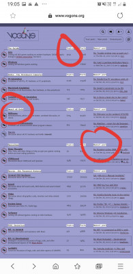
2. Far too many (disconnected) lines everywhere. The disconnected lines don't look good no matter what "era" you're going for, and make it look like your CSS is riddled with errors. The fact that the lines are usually punctuated by a mirrored but slightly diagonally offset dotted line makes it much worse. I guess it's supposed to be a sort of fake "3D" effect but it looks horrible. The disconnectedness; I get that that comes from wanting to make it look like a single line zigzagging back and forth, but the human brain simply doesn't see it that way. It just looks bad.
3. Color schemes: The "old school" color scheme obviously looks much better, but what if we want to experiment with still more color schemes? What if you included a black and white color scheme, for example?
4. Agree with others on the dithering. It needs to go.
5. Things are often too close together and squish into each other. An example I'm looking at right now is the title of the topic on the "full reply" screen; it's too close to the line and letters like "g" or "j" bleed into it. This happens a lot all over the forums; things are not given proper spacing.

I'll keep looking and testing.

World's foremost 486 enjoyer.

Reply 21 of 516, by keenmaster486

User metadata
Rank l33t
Rank
l33t

A little CSS bug on my profile page here:

Screenshot_2019-12-27_21-20-47.png
Filename
Screenshot_2019-12-27_21-20-47.png
File size
16.46 KiB
Views
2551 views
File license
CC-BY-4.0

World's foremost 486 enjoyer.

Reply 22 of 516, by keenmaster486

User metadata
Rank l33t
Rank
l33t

I notice “active topics” still works, as I have it bookmarked from whatever the link was on the old forum software. All it needs is a button on the home page. I would appreciate it a lot, not sure about others.

World's foremost 486 enjoyer.

Reply 24 of 516, by Stiletto

User metadata
Rank l33t++
Rank
l33t++

I have used Active Topics every day, multiple times a day, for months - typically ordering it to queue anywhere between 10 and 40 pages of posts at a time - and it's weird the "server log analysis" didn't pick up on that. I guess I was statistically insignificant. Curse all you navel-gazers visiting "Your Posts"!

Last edited by Stiletto on 2019-12-28, 06:18. Edited 2 times in total.

"I see a little silhouette-o of a man, Scaramouche, Scaramouche, will you
do the Fandango!" - Queen

Stiletto

Reply 25 of 516, by Stiletto

User metadata
Rank l33t++
Rank
l33t++

Okay, yeah - the "you have something unread in this thread" indicator is quite subtle. Especially in the oldskool skin. Really hard to see the difference, in my opinion at least.

Couldn't you, I dunno, invert the colors on the icon to give it a full fill or something? I -think- I'd rather a bunch of "SOLID ICON - empty icon - SOLID ICON - empty icon" than these... font changes and icon colored outlines?

Normal:

new-vs-old-1.jpg
Filename
new-vs-old-1.jpg
File size
99.77 KiB
Views
2532 views
File license
CC-BY-4.0

Oldskool:

new-vs-old-2.jpg
Filename
new-vs-old-2.jpg
File size
86.78 KiB
Views
2532 views
File license
CC-BY-4.0
Last edited by Stiletto on 2019-12-28, 06:21. Edited 1 time in total.

"I see a little silhouette-o of a man, Scaramouche, Scaramouche, will you
do the Fandango!" - Queen

Stiletto

Reply 26 of 516, by krcroft

User metadata
Rank Oldbie
Rank
Oldbie
Stiletto wrote on 2019-12-28, 06:02:

I have used Active Topics every day, multiple times a day, for months

Same (also many loads per day) - it was the only top-level page I used.
I would skim the list and background load the interesting threads. Literally the only features I use, plus the rare PM.

Reply 27 of 516, by Stiletto

User metadata
Rank l33t++
Rank
l33t++
krcroft wrote on 2019-12-28, 06:12:
Stiletto wrote on 2019-12-28, 06:02:

I have used Active Topics every day, multiple times a day, for months

Same (also many loads per day) - it was the only top-level page I used.
I would skim the list and background load the interesting threads. Literally the only features I use, plus the rare PM.

What was nice about it:
- you could order it to display all Active Topics for the last hour, day, week, month, year, etc. and it would just DO it and paginate at 25 topics per page, maxing out at 40 pages of topics. (I would allow it to keep paginating out to whatever the timespan selected was, 100 or more, but you'll have this. *shrug*)

- it displayed all topics posted in order by most recent reply, no matter if you'd read them or hadn't read them.

- the ones you hadn't read had a quite obvious colored indicator in the topic icon to show that you hadn't read it yet

- sometimes you needed to jump back to address a post that you'd read from a few days ago that you knew you hadn't got to yet, but maybe you hadn't been paying attention which subforum it had been posted in. Active Topics would still let you find it in roughly chronological order. Unread Posts would hide it as soon as you'd read it.

"I see a little silhouette-o of a man, Scaramouche, Scaramouche, will you
do the Fandango!" - Queen

Stiletto

Reply 28 of 516, by krcroft

User metadata
Rank Oldbie
Rank
Oldbie

The ASCII banner in the email notifications is broken (I sure like ASCII banners though! Maybe make the message HTML and then monospace-font the banner).
I guess the alternative is to set the default font in your email client or browser to a monospace font.

Also, the banner now consumes sufficient vertical space that gmail auto-collapses the remainder of the message (which contains the only valuable part: the link to the post).
So now requires I click the three ellipses, expand the message, and then click the link.

I think there's enough space to squeeze in a slightly tighter mono-banner, plus the link, and boil out the whitespace and "hello $username" stuff.

Attachments

Reply 29 of 516, by konc

User metadata
Rank l33t
Rank
l33t

Maybe some emphasis on the arrow that indicates a thread you have replied to? Because of the different thread icons it's difficult to spot quickly when scrolling.
It can be as simple as filling the arrow with the color of the surrounding circle, cyan or gray for unread/read threads. Not significant, just a small improvement that doesn't deviate much from the new design principles.

Untitled.png
Filename
Untitled.png
File size
48.49 KiB
Views
2497 views
File license
CC-BY-4.0

Reply 30 of 516, by KainXVIII

User metadata
Rank Member
Rank
Member

Number of pages that thread contain should always be visible (and not only until you enter actual thread).
Also needed some kind of button to jump at latest unread post in every thread (and in New Posts section too)

Reply 33 of 516, by KainXVIII

User metadata
Rank Member
Rank
Member
robertmo wrote on 2019-12-28, 16:09:
KainXVIII wrote on 2019-12-28, 13:42:

Also needed some kind of button to jump at latest unread post in every thread (and in New Posts section too)

Blue circle is the button

Ah, thanks!

Reply 35 of 516, by cyclone3d

User metadata
Rank l33t++
Rank
l33t++
StevOnehundred wrote on 2019-12-28, 16:35:
maxtherabbit wrote on 2019-12-28, 15:52:

+1 for Active Topics, it's the main way I use the site

Me too.

Same here. I very rarely went into the different sections unless I was making a new thread.

Yamaha modified setupds and drivers
Yamaha XG repository
YMF7x4 Guide
Aopen AW744L II SB-LINK

Reply 36 of 516, by keenmaster486

User metadata
Rank l33t
Rank
l33t

For those who want active topics the old link still works, here: search.php?search_id=active_topics

I just bookmarked it for now.

Edit: I agree with another user who said that the "animation effect" that scrolls down to your latest post after you hit submit is very irritating and unnecessary.

World's foremost 486 enjoyer.

Reply 38 of 516, by keropi

User metadata
Rank l33t++
Rank
l33t++
KainXVIII wrote on 2019-12-28, 13:42:

Number of pages that thread contain should always be visible (and not only until you enter actual thread).
[...]

yes this is something that should be added , it's annoying as it is...
also when you click on the thread in the "new posts" search results it should land you on the latest post not the 1st page of the thread that could be 5 years old

🎵 🎧 PCMIDI MPU , OrpheusII , Action Rewind , Megacard and 🎶GoldLib soundcard website

Reply 39 of 516, by j^aws

User metadata
Rank Oldbie
Rank
Oldbie
20191228_191036.jpg
Filename
20191228_191036.jpg
File size
1.79 MiB
Views
2399 views
File license
CC-BY-4.0

Can the subject headers in the white boxes and black text be changed to something that doesn't look out of place - something a bit more subtle that matches the colour scheme? Thanks in advance.