Although the design issues will be covered when it's time for a production run, I've had some free time and tried to formulate my suggestions in more understandable way illustrated by the attached madskillz 😀 Please take it as some ideas for additional consideration as I don't want to seem a little bit too much insistent - just want the project to happen as perfect as it can both in its consumer features and appearance 😀
So, here we go...
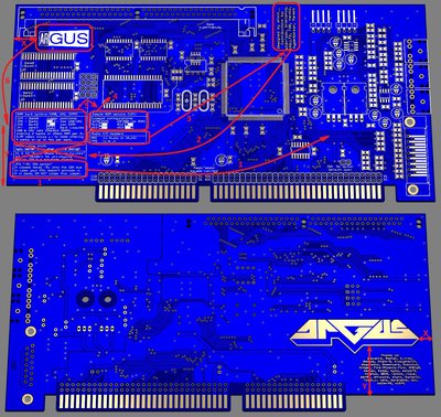
1. Split the "Prototyping stuff" section, delete the ISA-header part and move -5V jumper description closer to the jumper itself.
2. Move the "Designed by 2015 by shock__" and "Contributions by..." section to the place where "Prototyping stuff" section used to be, aligning it with the the "Thanks to" section on the back side in terms of horizontal and vertical offset from the edges of the PCB.
3. Move the "Audio I/O headers" section to the place where "Designed..." section used to be.
4. Put "Sample ROM options" right under the footprint of the ROM itself - as there will be no DIP socket and the ROM will by all means be soldered, there is no use in describing the alternative resistor options when the chip is already there. If someone solders it out and finds a description, it'll be a good surprise for him 😀
5. Move the "RAM banks options" section to the place where the "Sample ROM options" and "Audio I/O headers" used to be.
6. Move the ARGUS logo on the front side to the place where the "RAM bank options" section used to be, aligning it with the other logo on the back side in terms of horizontal and vertical offset (marked X and Y on the scheme) from the edges of the PCB as well as bringing them to some similar size (if possible, of course - but it will look much more professional, I guess).
7. Make the ARGUS logo on the front side in copper instead of silkscreen like the other one on the back side. I don't know if we can also play with the silkscreen, I mean, for example, put the frame and the filling of the right section in white silkscreen and the letters in copper. What do others think?
8. Add year 2015 somewhere, e.g. "Designed in 2015 by shock__", possibly followed by "... to commemorate the XX Anniversary of InterWave" as the space that has been freed up allows to do so.
9. Another point - does your plant provides for any silkscreen colors other than white? If yes, then I'd definitely suggest using yellow for all silkscreen inscriptions - just look how cool it is on the Roland SCB-55 and VideoLogic video cards!


