First post, by Kreshna Aryaguna Nurzaman

- Rank
- l33t
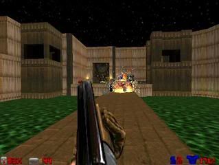
So I played Duke Nukem 3D last night, utilizing the high resolution pack. It is one of the linear first-person shooters that I actually like, due to its fast and furious gameplay and its atmosphere. But I also noticed the graphics. Despite its new OpenGL graphics engine, Duke Nukem 3D still sports "cartoonish look", just like old DOS games in 256 color era like Ultima VI and X-COM: UFO Defense.
And I really love it.
And I actually like it waaaay better than the drab, "stonewashed" look of many games. Correct me if I'm wrong, but it seems such trend started since the "true" 3D era (the first Quake). I don't understand why many games choose to spot such look. Is it an attempt of photorealism? Dirt 2 sports such advanced pixel shader features, but its overall look is drab and washed out despite how many colors 32-bit color mode can provide. No thanks, not me. I'd take cartoonish look and vibrant color any day.
But first thing first, my preference on cartoonish-looking graphics is regardless of gameplay. In other words, all other things being equal (including fun factor), I always prefer WarCraft III-esque cartoonish look over drab-and-dull "photorealism". My opinion about cartoonish look vs photorealism is being made in the context of graphics and graphics alone.
Note: I use the term "photorealism" quite liberally. I understand that actual photos have typically richer colors than "photorealistic" graphics of modern games. I merely use the term "photorealism" to stress its difference against cartoonish-looking graphics, but if you can find a more accurate term, then by all means.
Back to the topic, take a look at the following WarCraft III screenshot as example:
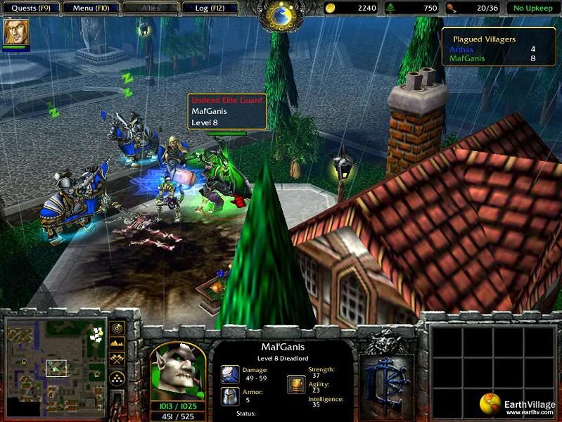
WarCraft III's cartoonish look.
Take a look at the picture above; trees and grasses look healthily green, the piece of cloth covering the knight's horses looks beautifully blue, the chimney's red brick stood in contrast against the other colors. And most of it, the overall colors are all rich and vibrant.
Now, take a look at the following Dirt 2 screenshot for comparison:
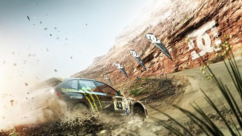
Dirt2 washed look.
What the hell. The brown cliff is not really that brown, the green grass look totally un-vibrant, the race track looks like an unhealthy mixture between pale green and pale gray. Everything looks drab and washed like a worn-out battle dress uniform. Probably I was wrong to call it "photorealism", and I doubt it, since even a cheap digital camera could take more vibrant colors than that.
That's the entire point of my complaint: modern graphics engines have such advanced shader model and 32-bit color, which translates to millions of color. Yet, most graphic artists in modern games choose to draw million and million shades of pale brown (or pale green, or pale grey, whatever) instead of the richness and vibrancy 32-bit color can provide.
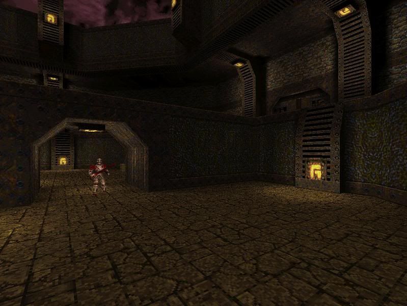
Not-so-modern games also suffer from such thing. For example, why does everything in Quake (the first Quake), for example, have to be colored with boring shades of brown? Is it an attempt of photorealism? Even Doom 2 puts more color --more vibrant color-- despite its more primitive graphics.
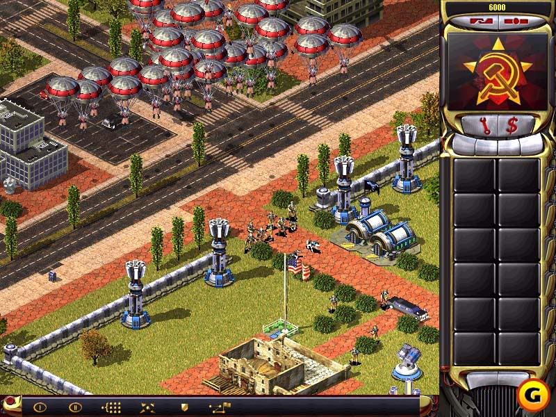
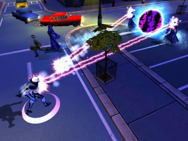
Fortunately, not all game designer follows such trend. Take a look at Red Alert 2, for example. It has richer colors than that of the first Command & Conquer. Yes, it looks more cartoonish than the first Command & Conquer, and it looks more like GI Joe instead of Saving Private Ryan. But heck, why not? Not every game has to sport the "grim and gritty look" that Quake does. I also realize that choice of colors is also constrained by theme. Fallout has a post-apocalyptic theme, so it is inappropriate to give it a cartoonish look like that of WarCraft 2. But again, not every game has to sport a Mad Max theme. Fantasy-themed games provide a good opportunity to feature cartoonish-looking graphics, with all the rich and vibrant color 32-bit color mode can provide. Superhero games also give more room for cartoonish creativity, and Freedom Force looks pleasing to the eye.
But then again, my preference for cartoonish-look graphics is made in the context of graphics and graphics alone. I still choose fun gameplay over vibrant colors. Take a look at Fallout 2; the graphics look washed and drab, but it is still a game I highly praise for its gameplay, despite its drab and un-vibrant colors. Besides, Fallout has excuse; it is a post apocalyptic-themed game. What is your excuse, Hexen II?
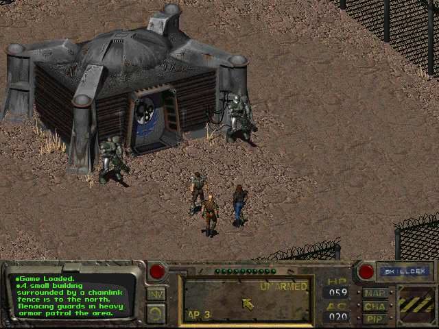
Fallout: a game I highly praise despite its washed colors.
Never thought this thread would be that long, but now, for something different.....
Kreshna Aryaguna Nurzaman.


