I have to agree with Kaminari that they look less like the originals than mine. Which is kind of ironic given your intention. Wink
😀 irony is the spice of life or the intent of mice and men or some damn thing
Actually *i think* my focus is in keeping the same basic light/color values where and when possible , and transforming some of the sculpture / landmarks to the kind of landmarks my eye is looking for. obviously perception o f a 2-d environment as a 3-d 'world' is going to radically alter this for every individuals 'hardwired' mental translation process .
er, but I wanted to make clear I am not under any circumstances knocking you are try to compete or something 😀, I am a total amatuer , it's just really fun to do this ( well except for the floor texture(s); I must have made about a billion of those so far and NONE of them look right ) and I am , of course catering ( to thte best of my ability ) to my own perverted tastes .
I try to avoid being anal most of the time , I am not really shooting for massive technical accuracy ( see note at bottom ) more like when switching between hi-low res that the textures for low res look as if they may have been generated from the hi-res textures . And even at that I am still changing things occasionally for lack of technical skill or worse , no better reasons than , er, because ..( that's my answer and I am sticking to it 😀
about the plants and foot prints I simply couldn't figure out how to do a good foot print ( then, that was a couple of months ago I think I have it figured out now 😉, and I didn't have decent plant pictures and I needed something to experiment with ( hey it was on the desk right in front of me and green at least, though the plants I used forlevel 3 have more 'accurate' representation 😀
You know it is the obviously professionly clean aspect of your panels that got me started thinking about how modern harware could ease some of the physcological burdens of viewing 'grit' . given the medium the gritty nature of my textures look REALLY bad at 'distance' when veiwed at 640x480 without AA or ansi .
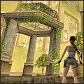
in no way it looks as remotely close to the original as TRX, in my humble opinion
😀 thank god it's not a race . though fear not I am as stubborn and almost as intelligent as a box of rusty nails , I shall continue to sally forth rusty armor, donkey and all .
oh , and by the way thanks .
note on accuracy :
In the original TR the accuments are a mismash of different cultures. for example it is highly unlikely that one would find the the center of the Aztec( mexico city ) calender wheel in a temple entrance in peru . In fact the temple is adorned with a blend of anachronistic aztec , olemec And a few traces of mayan glyphs/scupltures, few if any would ever be found in peru ( some would have to travel back in time in fact ) which was home to the Inca .
For example the calender wheel or the sun stone is an aztec artifact carved in 1479 and found under mexico city in 1760 (pretty far from peru) . A very recent artifact considering that the aztecs did not have as sophisticated or detailed a method of time keeping ( as the MAyans ) , though it was most cerainly taken from the mAYAns system due to the fact that the origin of the MAyan cultureand calender predates the aztec sun wheel by 0ver 5,000 years .
The picture used by the TR artists only depicted the center of the stone , which may have been done for space/clarity considrations or may have been done in a misinterpreation of how the mayans / aztecs wrote time . That being that ALL time was written in relation to 'zero time ' or about 3114 BC so that todays date would be written as x number of days months and years since day zero ( a bit cumbersome I know )
so the thinking may have been that if they only shown the center of the wheel that it would infer greater age , although the calender only shows the structure not the actual date and truncated as it is it only represents a calender that enumerates the information down to the 20months ( a calender without days in fact ) . Adding the outer ring to the wheel makes more sense but still doesn't reconsile the troubles of a recent aztec monument in an "ancient" incan (presumable if one is in peru ) tomb.
the 'dragon' or feathered serpent glyph carving over teh 'faces' entrance door is of teotichaun design ( end of the early clasic period ) and is taken from the directly from ( thoughthey threw in th e mayan gylph for death in the recursive areas ) the west wall of the temple of quetzalcoatl ( again 'central america')
most of the carved faces are of olemec orign , thougth the architecture of carving (structural) is a mix of aztec and mayan ( the walls are especially MAyan , whereas most of the moulding designs are aztec or mayan )
in the second and third level the architecture and glyhps are predominately mayan whereas the temple architecture is taken directly from an olemec site ( I even found the picture I believe they generate the original texture from )
So to be accurate ( anal) enough to worry about plant placement ( which moves and changes much faster than stone or cultural placement ) seems to pail when considering over-all 'accuracy' in regard to where the temple /tomb is actually located . (if the cultural references got older the deeper one went in it woul;d make sense I suppose , but one would still be dabbling in central american cultures )
As a curious side note the word 'Quincunx' is the 'common' name given to Mayan Glyph 'T585' the emblem glyph of the Piedras negras or the (place of ) black stones . [/quote]