First post, by aries-mu
Friends, I just had a eureka moment. A few moments ago, I just identified what is it that I don't like of modern, post-AT computer cases.
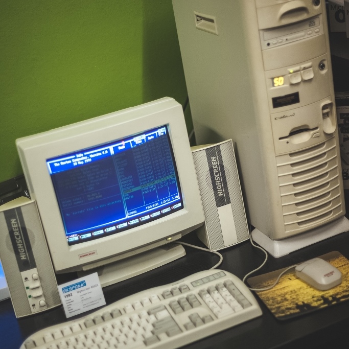
My computer passion was born with AT PCs and their traditional, old-looking cases, with square shapes and sharp decorations (from air fins to everything else), circa 1992.
Look at the charm:
https://x.com/Mnpctech/status/1248397250667020289/photo/1
After a few years, manufacturers decided to start getting 'creative'. Darn CURVED SHAPES! That's it! That's when abominations (in my opinion) like these started to come out:
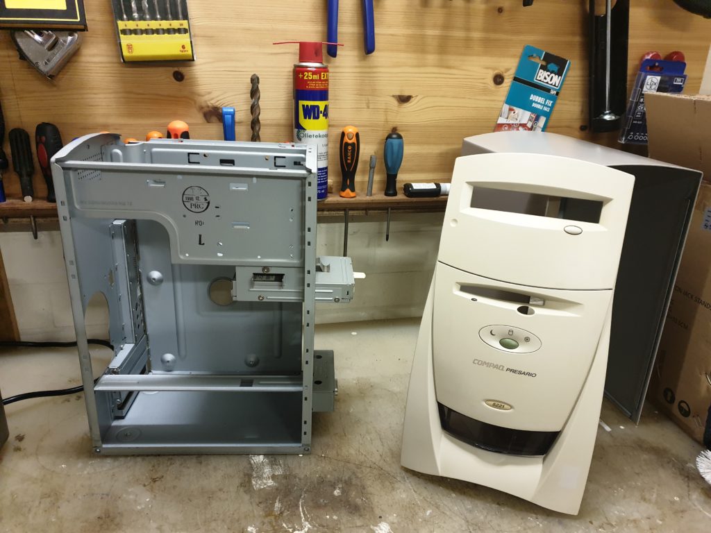
(↑ this one hurts, as I used to utterly love Compaq and their designs!)
And then things went completely awry. Some examples:


https://encrypted-tbn0.gstatic.com/images?q=t … 2NU2z0DB2OMJg&s

That said, aside from those darn curved shapes, the other big deal breaker for me were non-beige and non-light gray colors of course. Those horrible colors even at the beginning of the decadence:

Which then culminated with black, dark gray, and similar colors taking over the market completely, where once beige and light gray dominated. Ugly.
This is of course entirely personal and subjective. And I'd love to know your perspective on this.
EDIT:
Oh, I hate RGB lighting (or any lighting) too! Thanks to our friend @dormcat for reminding me of that abomination as well.
Finally, thanks to our friend @BitWrangler whom actually reminded me of this, I find also glass panes particularly ugly!
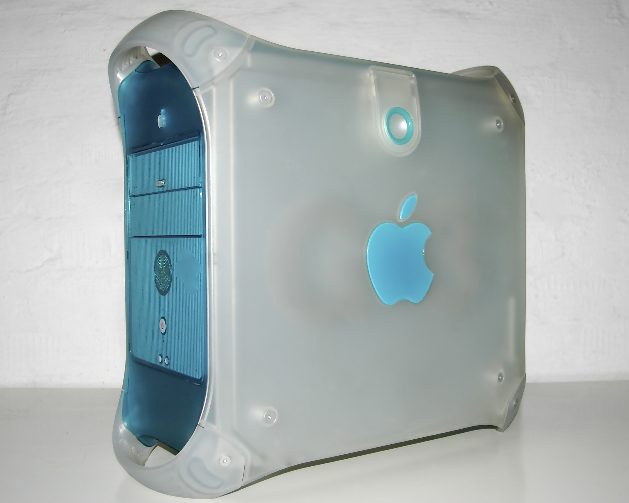
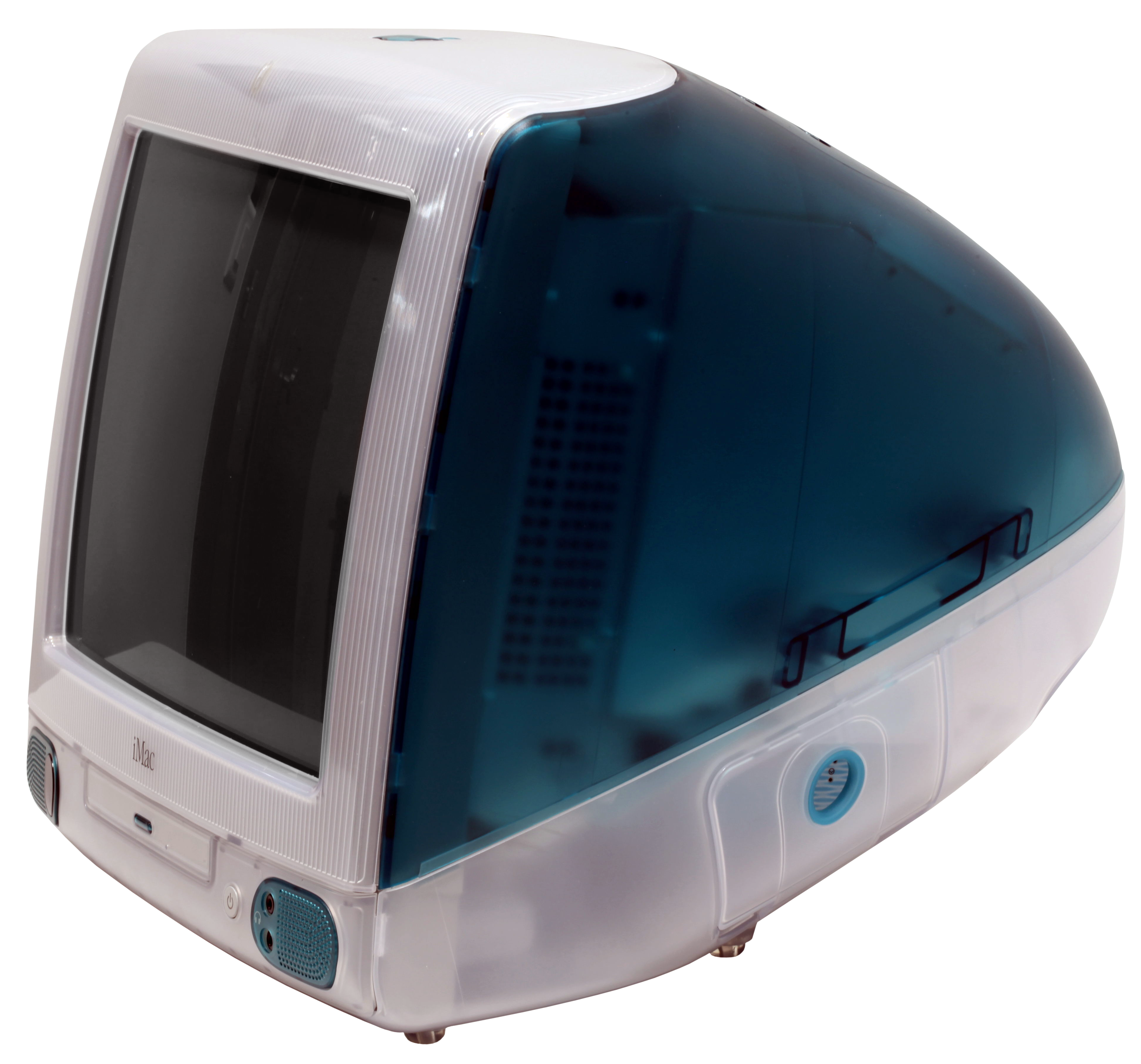
There were some exceptions though. I used to love some cases with curved lines, and I still do. For example:

They said therefore to him: Who are you?
Jesus said to them: The beginning, who also speak unto you
--
"physical media trumps cloud-simp servitude" (Conrad Riker)
--
Computers should be fun inside not outside! 😉 (by Joakim, VOGONS)